Websites
Restaurant Web Design Essentials
July 5, 2016
How to make a restaurant website that gets you more business
From the moment a guest walks into your restaurant until after they’ve paid the bill, you do everything you can to ensure they have a great experience. But what about the people who haven’t yet come in, but might like to? Chances are, the first interaction those people will have with your business is online—specifically, on your website. So what can you do to ensure that your website is designed in a way that best serves visitors, and, most importantly, turns them into actual guests?

Consider the Customer
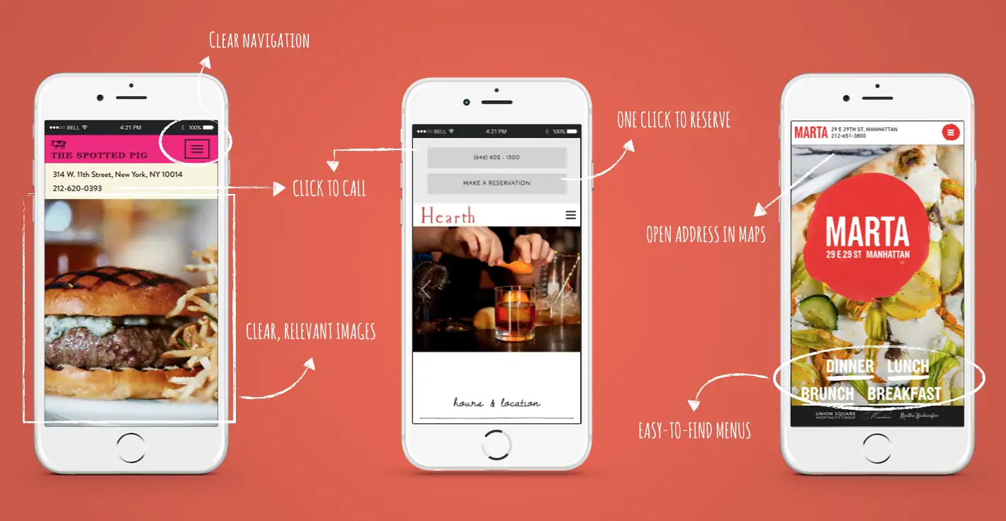
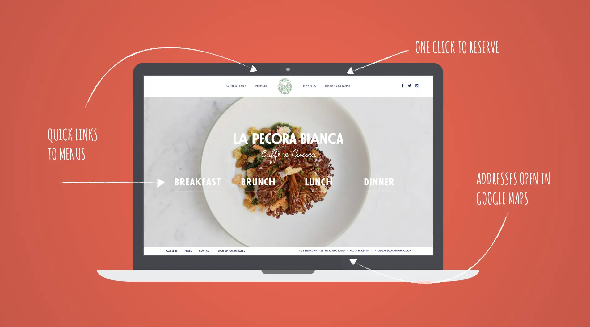
Much in the same way that you anticipate a guests’ needs in the dining room, think about what they want when they come to your site and design accordingly. Our data shows that when it comes to restaurant sites as a whole, most visitors are looking for the basics about who you are and where to find you:
Menus
Logistical information (location, hours, phone number)
Reservations
Online ordering (if available)
These are the most important pieces of information your site can have, and they should be prominently displayed and easy to read as soon as a visitor lands on your homepage. In fact, we recommend that restaurants “anchor” this info in a fixed spot on their site, so no matter where a guest scrolls, they can always see the basics at a glance. Much in the same way that you anticipate guests’ needs in the dining room, think about what they want when they come to your site and design accordingly.
Looks Matter

There was a time when restaurant websites were loaded down with music, flash animation and heavy graphics. Today, it’s more important to have a simple, fast-loading site with a few beautiful photographs and branding that reflects your overall style. This gives both prospective guests and potential employees a sense of what to expect when they walk in or apply to work with you.
Mobile is a Must
With the rise of smartphones, people are no longer confined to their desktops to browse the web. People visit restaurant sites while they’re on-the-go, often searching for where to eat while they’re in transit or in between tasks. Our data shows that on average, 50% of restaurant website visitors come from mobile, and that number spikes just before mealtime, proof that people are turning to their phones to figure out where to eat when they’re hungry. So it’s important to have a website that’s designed to adapt to mobile devices automatically, so your site is as useful on a phone or tablet as it is on the big screen.
Think About SEO
We’ll get into search engine optimization (SEO) in detail in another post, but at the most basic level, SEO is all about how Google and other search engines find your site and show it to people who are looking for it. For restaurants, one of the biggest SEO drivers is the menu, so it’s important to post your menus as HTML text on your site itself, rather than uploading a separate PDF that search engines can’t “read.” That way, when someone searches for “best burger” in your area, the search engine “sees” your delicious dry-aged burger with caramelized onions and bumps your site toward the top of the results list.
Other good SEO drivers for restaurant websites include an “about the team” section with bios on the chef and staff (which is also good for recruitment purposes), and a “press” page highlighting recent positive reviews and write-ups.
In future posts, we’ll get into more detailed tips and tricks to bring your restaurant web design to the next level, whether you’re a new operator or an established business considering a redesign.
Recommended

Commerce
How to Use Ecommerce to Boost Your Restaurant's Sales
June 24, 2020
Why restaurants should offer gift cards, merchandise and more online.

Commerce
Considering Online Ordering for Your Restaurant?
June 5, 2020
Here are some partner platforms worth exploring with pros and cons of each.


