Design Inspiration
The Best Cafe and Coffee Shop Websites of 2024
A roundup of cafes and coffee shops with beautiful, revenue-driving websites.
For years, cafes and coffee shops tried to be the “third place” for their customers: that special location between work and home, where someone could both enjoy the energy of being out in public and feel comfortable enough to sit for hours.
As fewer people work from offices these days, that “third” place might have gotten bumped up to second. Cafes and coffee shops are more important than ever to workers and networkers alike — and in order to bring people in, these businesses need to convey an inviting ambiance from the very first interaction a customer has with their brand. Often, that means having a great website.
Keep reading to see some of the cafes and coffee shops able to do just that. Here are several of the best cafe and coffee shop websites on the internet.
Cafe Patachou
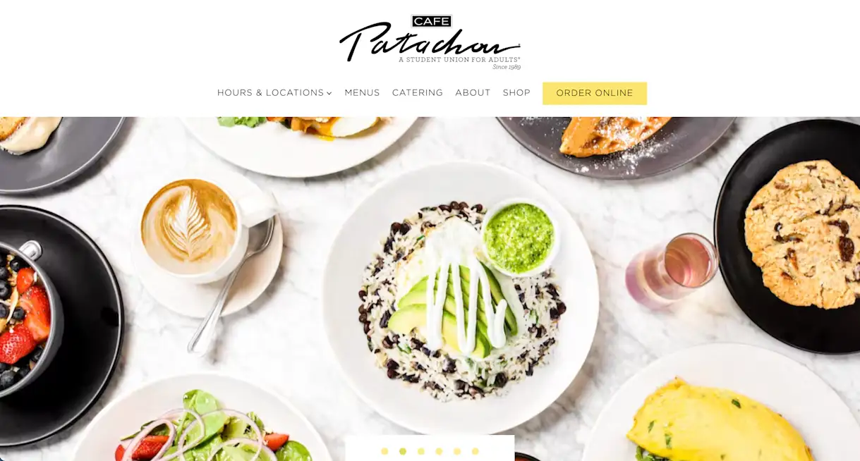
Cafe Patachou has such a friendly, congenial vibe that it has long been called a "student union for adults." Owned by Martha Hoover, a four-time James Beard Award semifinalist for outstanding restaurateur, it has also been named among the nation's Top 10 breakfast spots by Bon Apetit. Its website design is sunny, colorful and full of food photography that captures the premium scratch cooking on its menu. The website also features a robust merchandise store that sells apparel, mugs, coffee and the restaurant's signature cinnamon-sugar blend.
Lula Cafe
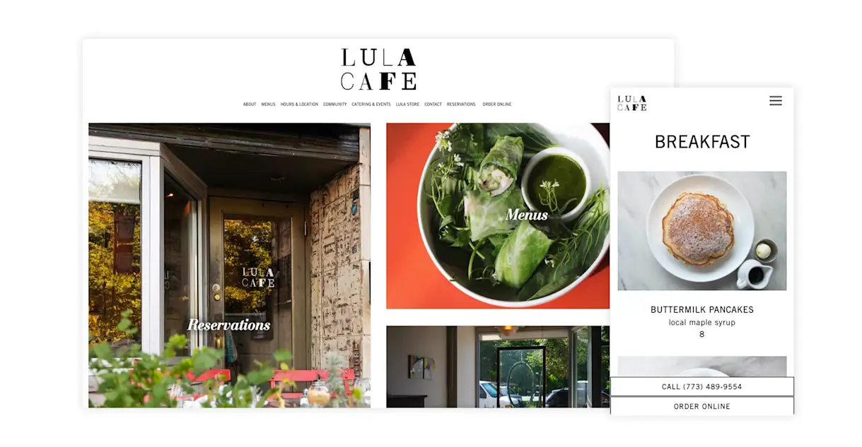
Lula Cafe is an inventive, market-driven restaurant that serves one of Chicago's most popular brunches. Chef Jason Hammel started the restaurant with his wife Amelia Tshilds in 1999, and although he was self-taught, he has grown into a two-time James Beard Award finalist for Best Chef Great Lakes. The cafe's website opens with large photo thumbnails that direct guests to key sections of the website (reservations and menus) with clickable buttons. The menu page is text-based — a key SEO tactic for restaurants — and includes beautiful pictures of menu items.
Saxbys
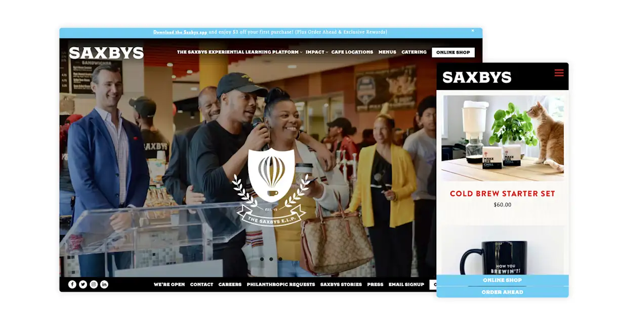
Saxbys is a coffee house chain with more than 20 locations, many of which are at mid-Atlantic colleges. Having already built brand awareness with many guests in its target audience, its website focuses on building brand equity through purpose-driven campaigns and initiatives. This includes a description of its Experiential Learning Platform, which helps provide education to student employees, along with full pages about its social impact and mission. Its merchandise store is filled with at-home coffee supplies, making it easy for site visitors to support them and their mission — while also brewing a great cup of joe.

RESOURCE
12 Must-Haves for Restaurant Websites
Take your digital front of house to the next level.
Buzz Coffee
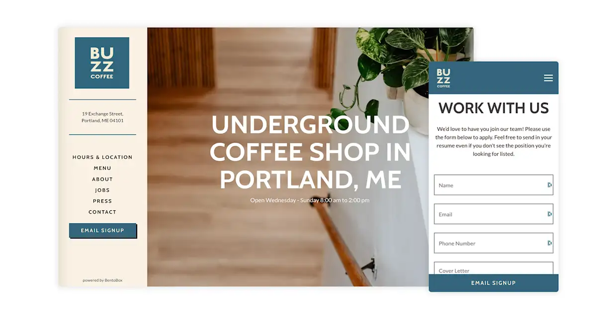
When guests arrive at Buzz Coffee's website, they are greeted with an alluring line of copy branding it an "underground coffee shop." The site doesn't elaborate on what that means, which adds to the intrigue and tacitly positions it as a place only locals and insiders would know about. Elsewhere on the website, guests can view the no-frills drink menu, which includes only eight items and no descriptions — another sign of confidence and intrigue. On a more practical level, the website also has a jobs page where workers can submit applications, removing a manual step from the increasingly tiring job of hiring restaurant staff.
Founders Coffee
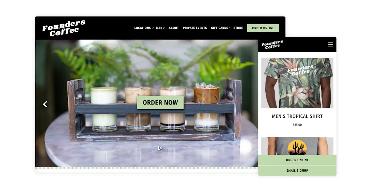
With a mix of sunny photography and mint-green textures, Founders Coffee's website exudes freshness. This is fitting for the Las Vegas coffee shop, which is focused on local ingredients and handcrafted beverages. But the web design isn't just for branding: It also directs all attention to the "Order Now" button, ensuring guests can't miss the call-to-action. If guests don't want to order food or drinks online, they can browse the playful t-shirts available in Founders' merchandise store.
Superba
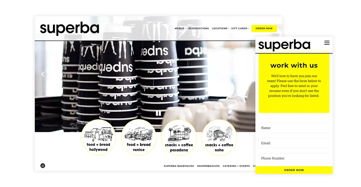
Great web design is achieved through a harmony of standout typography, supporting color schemes and intuitive functionality. Superba’s website achieves this with clean sans serif fonts and a simple black and yellow color scheme. High-resolution photography helps site visitors get a sense of the brand, its offerings and general vibe, while gestural illustrations on the homepage help guests navigate to sections for each of the shop's four locations.

BentoBox Marketing & Commerce Platform
Deliver Smarter Hospitality
Want to stand out online, bring in more money, engage your diners, and streamline operations?
Recommended
Design Inspiration
The 14 Best Brewery Website Designs of 2024
May 4, 2021
Our favorite brewery websites that are #poweredbybento.
Websites
Eight Websites. One Brand. How H-Town Restaurant Group Drives Success Online.
June 2, 2022
After struggling with its website vendor, the group made famous by Hugo Ortega took ownership & started to flourish.
Websites
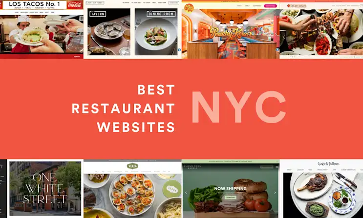
The Best Restaurant Websites in New York City
August 3, 2022
NYC restaurants are using BentoBox to grow their brands and increase their revenue. Here are some of our favorite examples.
