Design Inspiration
The Best Bakery Websites of 2024
A roundup of some of our favorite bakery websites.
Here’s one great thing about a bakery: to people walking by on the street, the store practically markets itself. No other food business can rely as much on sweet, sugary deliciousness wafting out to the air outside, luring in passersby like a magic flute. But in the age of the internet, sugary scents only get you so far. Bakeries also need to appeal to customers from afar — on smartphones, computers and other devices they use to discover new restaurants.
Learn how 12 notable bakeries use food photography, branding, illustrative design and compelling storytelling to create websites that draw in guests.
Lost Larson
Chicago, IL | lostlarson.com
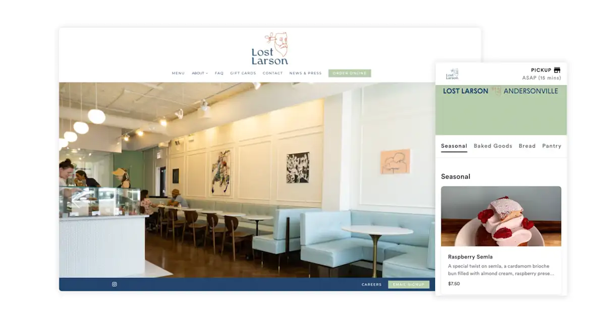
Specializing in long fermentation baking, Lost Larson in Chicago, IL, is a bakery rooted in traditional craftsmanship. To complement its old-world production, its website uses a minimalist and clean design that relies on unique illustrations for a modern and approachable aesthetic. In addition to introducing guests to its business and core values, the website drives revenue across two locations with BentoBox Online Ordering. Taking it a step further, each location’s online store is well-branded and includes high-quality food photography that captivates guests.
Little Tart Bakeshop
Atlanta, GA | littletartatl.com
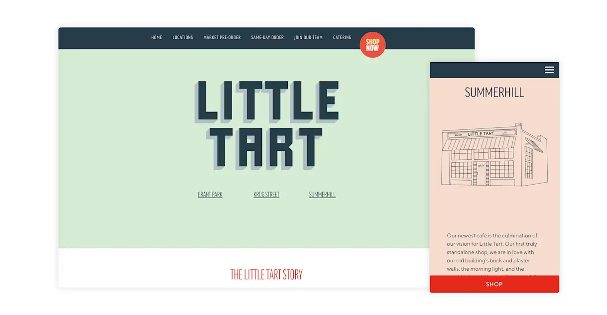
Since starting as a farmers market-only business in 2010, Little Tart Bakeshop in Atlanta, GA, has grown to include three storefronts while still maintaining its farmers market presence. With multiple locations for guests to choose from, it’s key that the homepage of its website immediately highlights where guests can find its “French-inspired, Southern-inflected” pastries. With bold colors, animated “Shop Now” buttons and an Instagram gallery, this modern website lends personality to the brand while showcasing up-to-date offerings and bakery news.
The Fox in the Snow
Columbus, OH | foxinthesnow.com
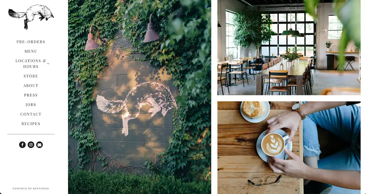
The first thing guests see on The Fox in the Snow’s website is high-resolution photography that entices them with beautiful, warm and inviting visuals. The Columbus, OH, bakery and coffee shop is known for its rustic-style baked goods and maintains its down-to-earth vibe with simple content and easy-to-navigate design. Since the bakery has three locations, its website drives additional revenue with digital gift cards that guests can purchase online and redeem at any location.
Back Door Donuts
Oak Bluffs, MA | backdoordonuts.com
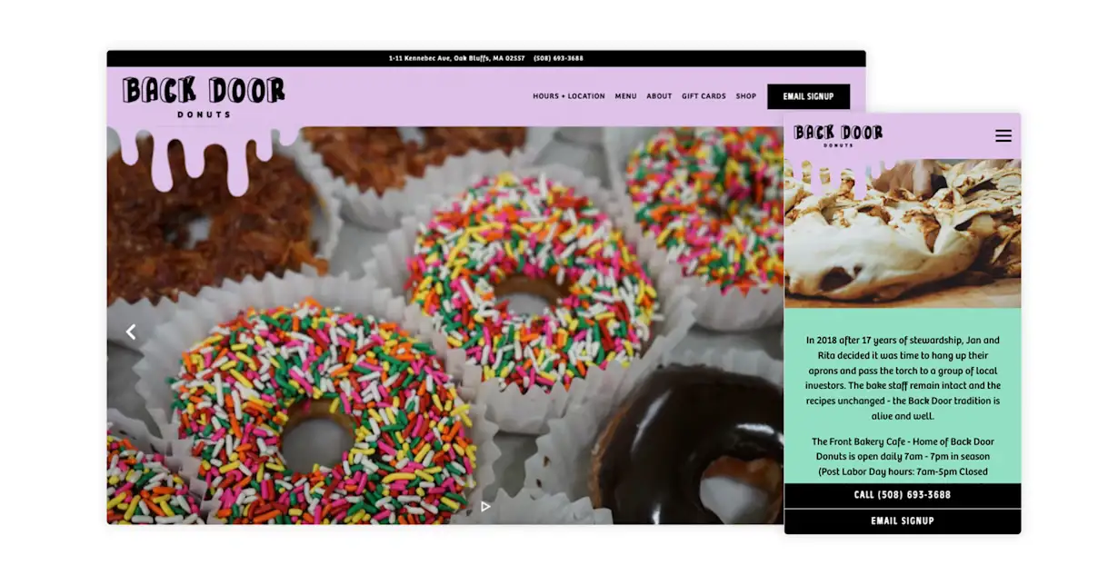
After starting behind a nondescript purple door in the parking lot of a supermarket, Back Door Donuts has grown into a two-in-one bakery for the residents of Oak Bluffs, MA. Honoring its humble beginnings, its website captures site visitors’ attention with a fun, illustration-heavy style that highlights its signature color, purple. Having relocated to a building that has housed bakeries since 1948, Back Door Donuts’ website uses creative storytelling to connect its new business operations to the rich history of its predecessors.
Sugared & Spiced
Edmonton, AB (Canada) | sugaredandspiced.ca
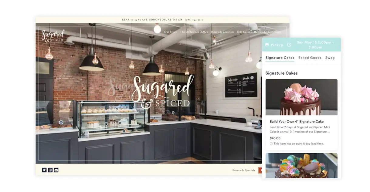
Sugared & Spiced in Alberta, Canada, proves that a homey and cozy website can still be modern. The website establishes the unique relationship between baker and guest, using the FAQ and Our Story pages to introduce Sugared & Spiced to the community. On top of that, the website serves as a revenue driver, using Pre-Order & Catering, digital gift cards and a merchandise store for club subscriptions.
Mochi Joy
Noblesville, IN | mochijoydonuts.com
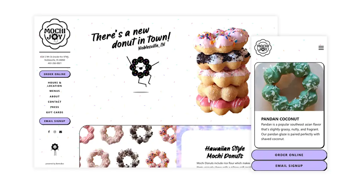
Mochi Joy’s website has a distinct vibe: sprinkle backgrounds, purple tie-dye overlays and a whimsical mochi donut mascot. Its donuts are especially photogenic, and because of that its website relies far more on visuals than copy. After all, a picture's worth a thousand words. The Noblesville, IN donut shop also drives revenue on its website with BentoBox Online Ordering and digital gift cards.
She Wolf Bakery
New York, NY | shewolfbakery.com
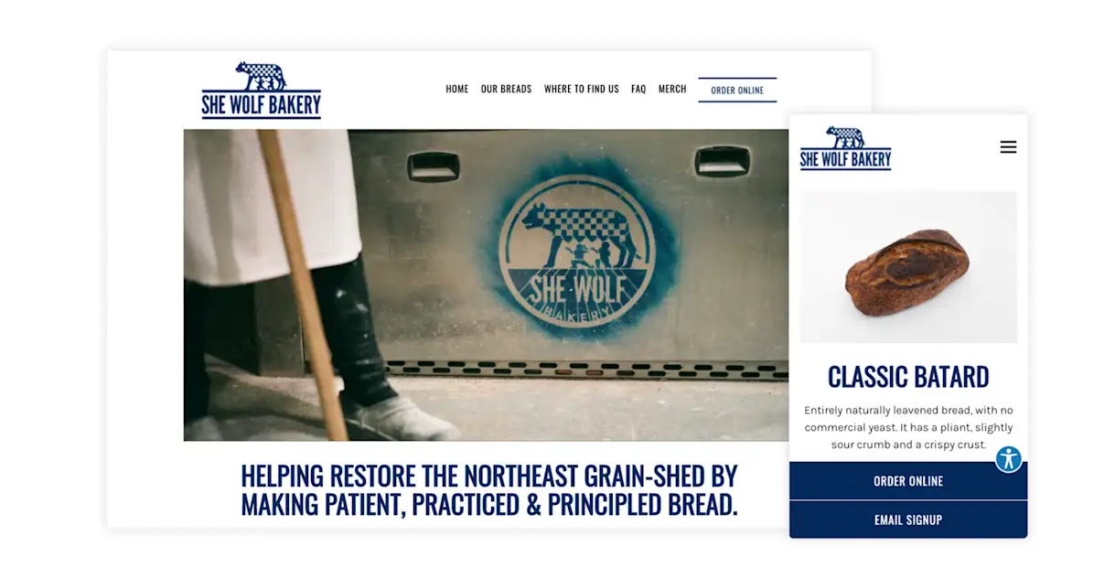
She Wolf Bakery sells a variety of natural levain breads at nine NYC greenmarkets. To keep guests up-to-date with accurate information on available breads and its market schedule, its website employs a clean and informative layout. Additionally, the website uses overlay alerts that pop up or appear on the header of the homepage to provide important information like job postings and giveaways. This ensures priority messages get extra visibility.
Jane
San Francisco, CA | itsjane.com
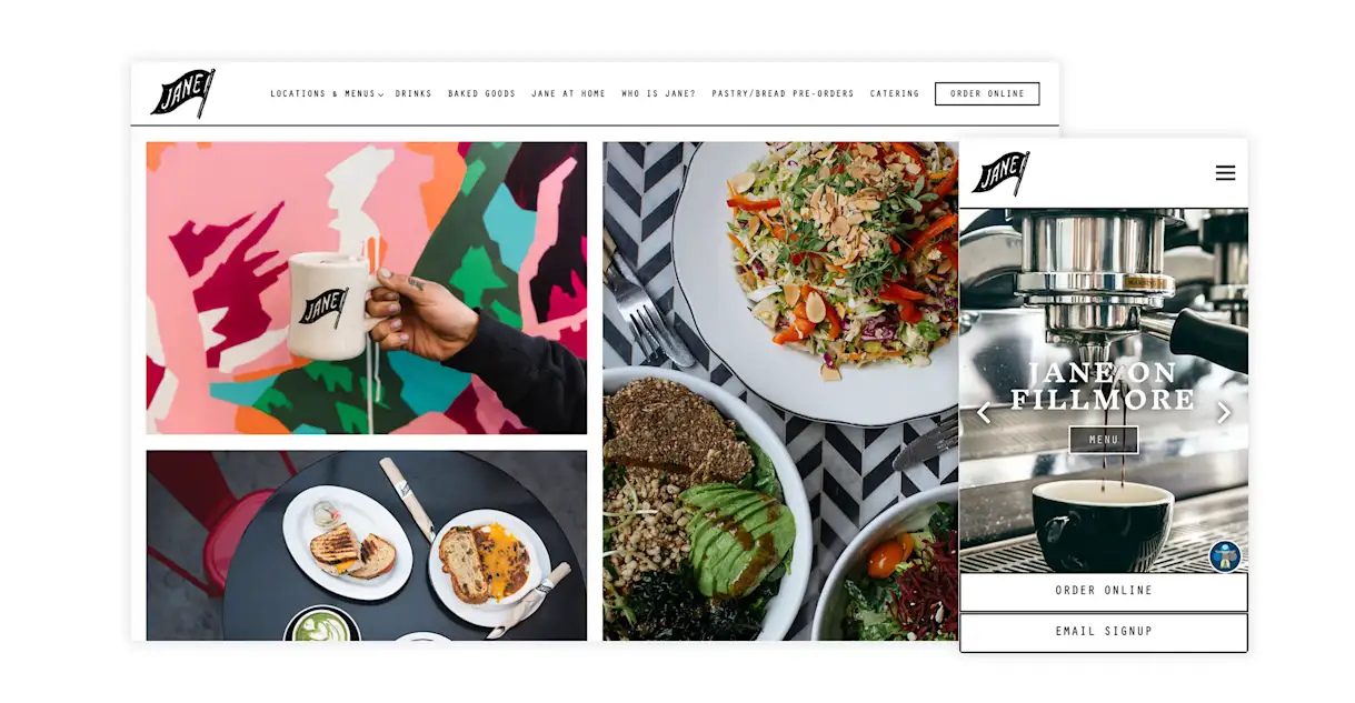
Instead of words, Jane’s website welcomes guests with a collage of hi-res photography that clearly conveys the bakery’s vibe. With five locations in San Francisco, CA, Jane’s website uses a dropdown menu to help guests find the location closest to them. Each location's page features its own hero visuals, which gives each location an independent brand under the Jane umbrella — but they're all tied together by the unique pennant flag logo seen across the site.
Fan-Fan Doughnuts
Brooklyn, NY | fan-fandoughnuts.com
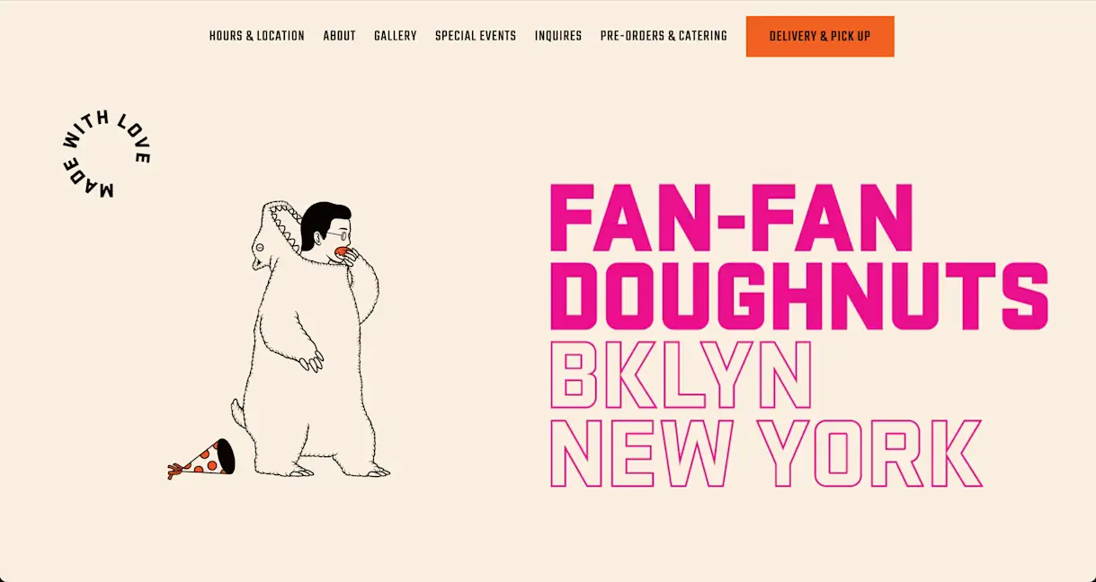
This charming, buzzworthy bakery from Mexican-American baker Fanny Gerson is one of New York City’s most celebrated sweets shops. The brand’s sense of humor and openness comes across starting with their whimsical homepage, with a fun animation of a (squints) dinosaur-man chomping on a pink donut, and a layout that uses negative space to invite the site visitor in to learn more. Beyond the homepage, the site is simple but clean — and as full of inspiration as Gerson’s creatively-named donuts.

BentoBox Marketing & Commerce Platform
Want to stand out online? Let's chat.
Drive revenue directly through your website.
Recommended
New Openings
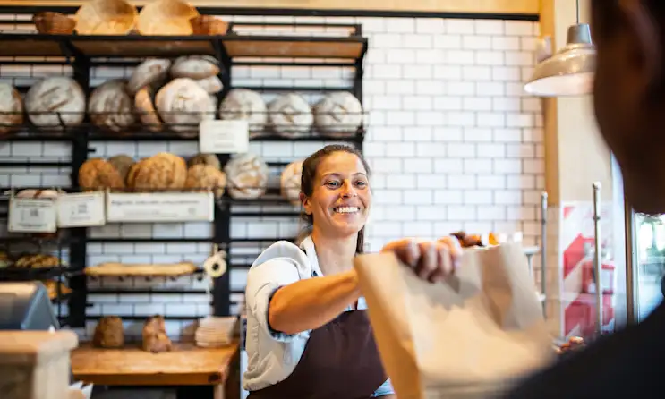
How to Open a Bakery: The 6 Key Steps
June 20, 2023
A step-by-step guide to planning, financing, designing, staffing, and marketing a new bakery.
Commerce
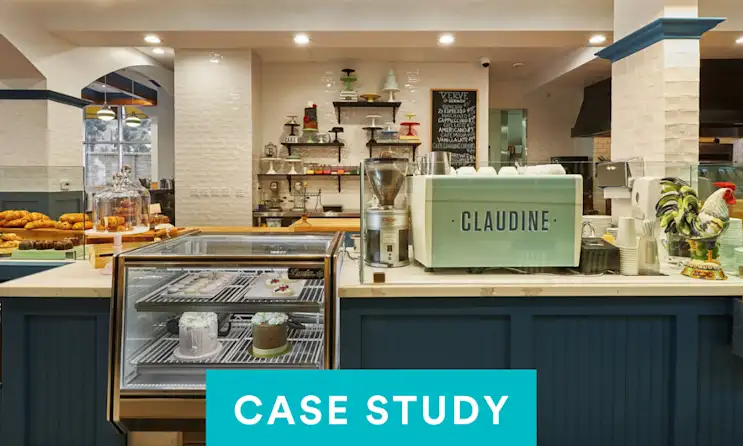
Claudine on Selling Event Tickets and Growing Their Catering Operations
December 15, 2016
How the LA-based restaurant and bakery uses digital tools to grow their business
Design Inspiration
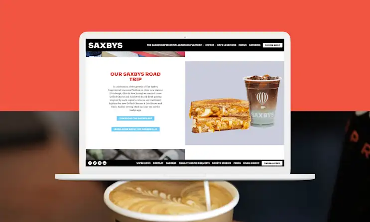
The Best Cafe and Coffee Shop Websites of 2024
March 23, 2023
A roundup of cafes and coffee shops with beautiful, revenue-driving websites.


