BentoBox News
Behind the Scenes of BentoBox’s New Branding
October 3, 2018
How and why we updated our visual identity
Since 2013, BentoBox has been on a mission to help restaurants bring their visions of hospitality online. Last November, we decided it was time for our own business to get a little facelift, to better align who we are with how we look. Our team put their heads together, and with additional support from Polygraph Creative we were able to reestablish our visual brand identity from the ground up.
Our Mission
The goal of our rebrand was to better communicate the ideas of warmth and hospitality, while still representing our stance as technology and restaurant website design experts. As our company grew, it became increasingly apparent that we needed a logo that represents everything we stand for and is versatile enough to work across all forms of media and technology.

Out with the old logo, in with the new!
So What’s New?
The updated BentoBox visual identity has some exciting new elements, like our new logo, which is composed of three key components:
Symbol
Wordmark
Color Palette
Symbol
Our initial inspiration was the international symbol of hospitality: the pineapple. However much we experimented with communicating hospitality in other ways, we kept coming back to this idea. After several iterations of a literal pineapple, we opted for a more simplified, abstract icon that better matched our identity.
The first and most obvious image in our new symbol is our BB initials. We’ve used our initials as the foundation of the imagery, but it's about more than just our name. To incorporate a pineapple, we broke the BBs into 4 arches creating a simplified crop of the texture of pineapple skin. We used shades of vibrant tomato red from our palette in the three uppermost arches to form a chevron arrow, which speaks to our vision of being the technology that elevates every interaction between the restaurant and its guests.
Taking a step back, you can even make out that our symbol resembles an overhead view of a classic Japanese bento box— representing several of our great features joining as one. In the end, we have been able to create a symbol that is at once simple, yet also holds a deeper meaning— a metaphor of what BentoBox is to restaurant owners and operators.

The different elements that went into creating our new symbol.
Wordmark
Our wordmark was crafted to come across as friendly but authoritative. One of our biggest gripes about our previous wordmark was that it felt flimsy and didn’t read well at smaller implementations. It came across as cold in some instances, a vibe we wanted to move away from. The solution: thicker, more rounded letter shapes that give a more welcoming feel.
The curved shapes of our letters set the tone for our symbol. The arches that make up the symbol were derived from the negative space within our uppercase “B,” the smooth curve of our lowercase “b,” and our unique lowercase “n” shape.
The new wordmark for our logo.
Color Palette
Our brand colors have primarily remained the same, with slight adjustments in brightness and variety. We’ve expanded our classic “tomato” color into new secondary shades of varying intensity, and introduced a warm yellow we’ll use occasionally.
The BentoBox logo has been functionally designed to match our primary color palette, allowing flexible usage. As we communicate with a range of light, dark and bright colors, it’s essential that our logo is flexible enough to work with all of our brand assets. Our logo was designed in various colorways for best use across all potential applications, within and outside of our color palette.
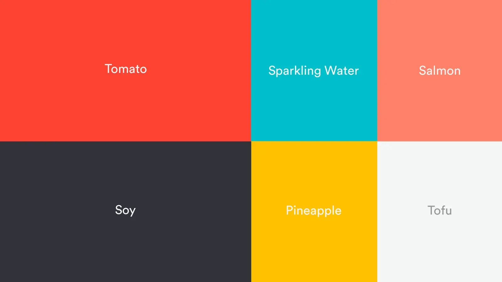
Our new color palette.
A Total Package
Everything about our new branding is anchored in what truly matters. In seeking to represent our company's mission, we ’ve developed a visual identity that speaks directly to our audience: restaurants looking for a trustworthy technology partner to help them extend hospitality beyond the meal.


BentoBox Marketing & Commerce Platform
Deliver Smarter Hospitality
Want to stand out online, bring in more money, engage your diners, and streamline operations?
Recommended

BentoBox News
2017: BentoBox's Year in Review
February 6, 2018
An inside look at the biggest restaurant industry trends of the year— and what they mean for you
Marketing
Secrets Of Restaurant Branding
September 20, 2016
How to make a lasting restaurant brand with the pros at LMNOP Creative.
BentoBox News
Online Ordering for Restaurants: A Solution Aligned with Operators
February 5, 2020
Bento Ordering accepts and manages pickup and delivery orders
