New Openings
Restaurant Branding: From Dish Names to Interior Design
July 6, 2023
A guide to creating a strong restaurant brand that attracts and retains diners.
Opening a new restaurant requires a lot of moving parts, not to mention the thousands of tiny details that can get overlooked. The list can be exhausting, but don’t forget your brand is at the center of every decision you make.
How do you want to be represented? Is your brand loud or whimsical? Or is it more humble and sophisticated? How you present yourself becomes your identity and determines who will become loyal guests.
Building your business and its physical and digital presence includes designing logos, menus, and branding materials, as well as taking high-quality photography of your food and interiors and all of the important information you’ll want your guests to know. Here’s what to keep in mind as you go through the process.

RESOURCE
How to Open a Restaurant [Free Guide]
A step-by-step guide to planning, financing, staffing, stocking and marketing a new restaurant for its debut.
What is Restaurant Branding?
Restaurant branding is the process of creating a unique and memorable identity for a restaurant. It involves developing a cohesive image through elements like the name, color palette, and interior design. The goal is to differentiate from competitors, connect with customers, and build loyalty. A strong restaurant brand reflects the values, ambiance, and desired positioning of the establishment.
When a guest walks into your restaurant, they take in the table settings, the artwork and furniture, and the sights and smells of the food. It should be a transformative experience for them, even if they aren’t always able to put their finger on everything that’s happening. They don’t know why the room feels so warm and inviting, but they do know they like it.
It’s those moments — those thousands of little things working together to define a space — that make up the core of a restaurant’s brand. And these days, it’s not just about how a restaurant represents itself at the restaurant. Digital presence is just as important, if not more: 86% of diners do online research before trying a new restaurant.
There is no such thing as copy-and-paste branding. A brand should be unique to your concept and the guests that you hope to attract. What works for a casual burger counter will not necessarily work for your uptown trattoria. Consider why you opened your restaurant and what about the restaurant is most important to you.
Below, we’ll cover the many different components that make up a restaurant’s brand.
Brand Identity
A brand identity is how a restaurant presents itself to the world. It reflects a restaurant’s unique values, style, and overall diner experience. It includes elements like logos, color palettes, typography, ambiance, decor, menu offerings, staff interactions, and even the tone of voice used in marketing materials.
This is what sets a restaurant apart from its competitors. A strong restaurant brand identity creates a cohesive and memorable impression that customers can connect with, fostering loyalty, and attracting new customers. It not only communicates the restaurant's story and vision but also shapes customer expectations and perceptions, ultimately influencing their dining experiences.
Logo
A good restaurant logo is simple, functional, and relevant. For restaurants, it’s important to have a logo that conveys the restaurant's personality. The logo should be practical so that it can be used in an array of different print and digital scenarios and remain legible. Lastly, the logo should reflect the restaurant's image by utilizing fonts and colors that are true to the restaurant’s identity.
Two Ways to Create a Logo:
DIY: Download Adobe Illustrator if you want to make your own logos. If you’re looking for a quick mock-up, Looka or Canva are great alternative logo generation tools. Ensure the logo master file is saved as a vector graphic. For web, make sure to upload as .jpeg or .png format at a minimum of 72 pixels-per-square-inch (PPI). Create multiple variations of the logo for a variety of uses. This includes different orientations (horizontal, square, vertical) and different compositions for maximum flexibility. Make sure that it looks good in color and black and white depending on the media type, especially for print.
Agency: Hire an agency or studio if you have a larger budget and want to completely transform your entire restaurant identity (pricing: $5K-$20K+; timeline: 3-12 months). For smaller-scale projects, a small studio or freelance designer can help produce a fresh new logo or branding redesign that works with your existing identity on a smaller budget (pricing: $300-$5K; timeline: 1-3 months).
Brand Voice
To get diners through your doors, you need to speak to them in a way that both encourages them to visit and also gives them a sense of what to expect when they do. This is known as brand voice, and it’s made up of two different parts: language and tone.
Language is what you say while tone is how you say it. Think about your brand’s persona and the best way to represent that in written form. To get started, create a list of adjectives and attributes that you want your brand voice to embody. Consider words that describe the desired tone, personality, and style of communication for your restaurant.
Your brand voice should be consistent on all touchpoints, from your restaurant’s website to your Instagram captions to marketing emails.
Restaurant Name
A name is your first impression, so make it count. Picking a great restaurant name can be one of the most challenging creative decisions that you’ll make. The name should be unique but still easy to remember and have a meaningful backstory. Plus, it needs to stay true to your concept.
Read more: The Ultimate Guide to Restaurant Name Ideas
Interior Design
“Design plays a huge part in the restaurant industry, and can tell you a lot about a brand,” said Jaqueline Andre, Director of Design Operations at BentoBox.
“Think about how we categorize restaurants and the interior design of the physical space: QSRs are designed for their guests to easily get in and out, while a fine dining establishment is going to create a more cozy atmosphere to allow you to settle in for longer.”
Is your dining space a warm and cozy diner that invites people to stay awhile or a small but efficient food counter where you want people to grab their grub and enjoy at home? Your interior design can communicate this. Pay special attention to lighting, layout, colors, the entrance and table styles. This will greatly impact how someone feels as soon as they step in your restaurant.
Read more: 32 Instagrammable Restaurant Decor Ideas
Menu & Dish Names
The menu is another opportunity for you to show personality. By using colors, fonts, illustrations and icons, the menu can help customers make satisfying choices. The menu should be formatted into sections that allow the customer to easily scan through what you offer. Too many food and beverage options can be overwhelming for your guests. The ideal number to remember is 7 options per category.
It’s also important for your online menu to be text-based, or readable by screen readers, which reads your website for visitors with disabilities. You can read more about digitally accessible websites and the Americans with Disabilities Act here. Choose appropriate colors that fit with your other branded materials for brand consistency and legibility. Use colors that are easy to see and font choices that are simple to read. Menus should be formatted easily for both digital and print — creating a design that would easily translate to your website.
In terms of dish names and descriptions, it’s important to understand what moves the needle. Putting effort into how you describe dishes can affect food sales and draw eyes to particular items. According to the Food and Brand Lab at Cornell University, using descriptive words for your dishes can increase sales by 27%. Entice your guests.
Read more: How to Write the Best Menu Item Descriptions
Menu Best Practices:
Layout: Make sure the menu is formatted so the customer can scan it easily, and digest the content in sections. Make sure your options sound satisfying by using appetizing language and item descriptions.
Sections: Break your menu up into separate pages rather than trying to fit all of your options on a single page. This creates a better guest experience.
Consistency: Use the same typography, colors and graphics as all of your other branded collateral.
Music
Are guests sitting down to soft jazz in the background or shouting at each other over Top 40 hits? When you’re trying to curate an ambiance for your concept, what your guests hear can be as important as what they see and taste. You should match your restaurant playlist to your brand and the type of audience you want to attract.

BentoBox Marketing & Commerce Platform
Opening a New Restaurant?
Help customers find you. 80% of diners search online before visiting a restaurant.
Where to Use Your Restaurant Branding
Consistency in your branding across digital platforms (like your website, social media, and email) and physical assets (like your printed menus, merchandise, and takeout packaging) is key.
“Restaurants have many points of customer interaction,” says Kayla Scheidel, Senior Manager of Web Design at BentoBox.
“A customer not only interacts with the physical space of a restaurant when they dine in, but they also engage with the restaurant's digital space, whether it's by going on the restaurant's website to look at a menu or browse its social media pages for what to order next.”
Digital Brand Assets
Once you’ve established your brand and decided what sets it apart from other restaurants, it’s time to make sure people know about it. Use your digital channels to promote your restaurant to current and future diners.
Website. Regardless of your concept, you’ll need a website. A strongly branded website acts as your digital storefront, allowing guests to get basic information about your restaurant like the hours, location, menu, and contact info.
Social Media. Your social channels provide a two-way conversation between your concept and the community you serve. And the color palette, typography, voice and tone we discussed earlier on? This is where you can reinforce those brand elements. Put effort into developing a social media presence and meaningfully engaging with your followers.
Email. Once you're in someone's inbox, you have the opportunity to build stronger customer relationships and foster greater affinity for your concept. Email is an excellent method for follow-up engagement, and by consistently writing in the appropriate voice, you build brand equity.
Food Photography: Remember this: we eat with our eyes. Captivating and appetizing food photography should be used across your website, social media, and email channels.
Physical Brand Assets
In addition to honing your digital assets, you’ll need to pay close attention to the tactile brand elements people will encounter once they enter your restaurant.
Printed Menus. Your menu design can make or break you. It’s one of the first branded materials potential guests will interact with so make it count. Get creative with layout and color scheme, but be sure that your menu design stays true to your restaurant’s identity.
Merchandise. There’s no greater buy-in your restaurant will get than a loyal guest proudly sporting your merch. Tees and sweatshirts can be a great place to start but it doesn’t have to stop there. Restaurants are offering branded glassware, cookbooks, marinades and even cold brew machines.
Takeout/Delivery Packaging. When it comes to to-go packaging, think beyond a nondescript brown paper bag. Stamp your logo and your distinctive color scheme on cups, parchment paper, boxes, and bottles. When you think of how often some households will reuse bags, branded delivery packaging is a chance to stay top-of-mind.
Signage. Does your tucked-away speakeasy call for a bright, flashing neon sign or no sign at all because if you know, you know? Signage can be a way to catch eyeballs in the daily foot traffic of your street or just make locating it easier for newcomers.
5 Examples of Great Restaurant Branding
Wondering how all of the branding elements come to life…in real life? Here are five examples of real restaurants whose branding shines through across all of their platforms.
Dudley’s
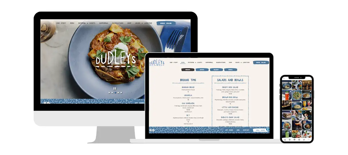
Dudley’s in Manhattan’s Lower East Side uses a tasteful application of assets like the patterned sticky footer, an emerging dotted-hover line in the navigation, and custom designed buttons. The restaurant’s blue and white color palette is soft and inviting. You can see it take shape across their digital presence as well as on their front door, dishware, takeout packaging, printed menus, merchandise, and coffee mugs.
Peaches Patties
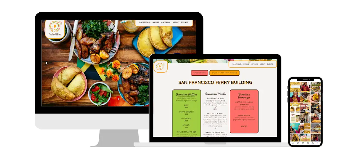
Peaches Patties is a Jamaican catering company based in San Francisco. Their branding is bright, colorful, and fun — a representation of their warm service and vibrant island cuisine. The website uses split transitions to animate drop shadow photo borders from squares to circles, making the digital experience feel very interactive. On the menu, you’ll find descriptive dish names that paint a clear picture of what to expect. Diner imagery takes center stage on social media, adding to the community feel of the branding.
Sullivan’s Fish Camp
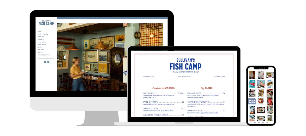
At Sullivan’s Fish Camp just outside of Charleston, South Carolina, you’ll feel like you’re stepping inside a 1970s sailboat. See their branding across interior design choices like custom stained glass billiard lamps and a gallery wall as well as right on your table with illustrated placemats. Merchandise is a core component of their restaurant’s brand strategy as well, so much so that they’ve set up a Merch Shack for all their souvenirs like hats and boat keychains.
The Dearborn
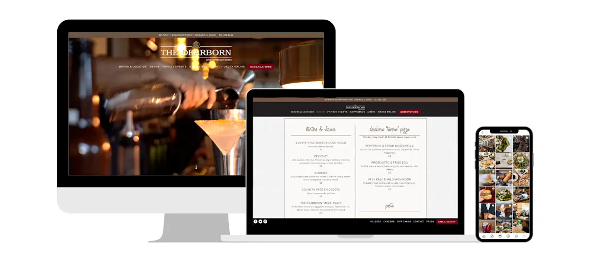
The Dearborn in Chicago is an upscale American tavern that celebrates its Midwestern roots. You’ll see call-outs to this on the menu — dish names like “Midwest Fried Chicken” and “Midwest is Best Salad.” The color palette features brown, maroon, and gold accents that are used across their website. Their social feed is filled with strong food photography that shows off their concept in exactly the right way, illustrating their menu items that are made from high quality ingredients yet feel unfussy and approachable.
Bar Pasquale
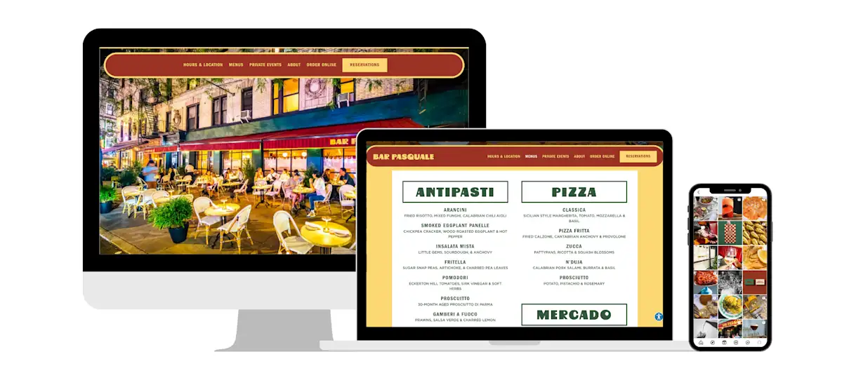
Bar Pasquale in New York City is an Italian restaurant that takes inspiration from Sicily to create a playful and bold application. Bright yellows, reds, and greens are consistent across their website, takeout packaging, and collateral like match boxes and coasters. Inside the restaurant, there are burgundy red leather banquettes and vintage furniture that transports you right to the Mediterranean Sea island.

BentoBox Marketing & Commerce Platform
Deliver Smarter Hospitality
Want to stand out online, bring in more money, engage your diners, and streamline operations?
Recommended
New Openings
The Ultimate Guide to Restaurant Name Ideas
July 13, 2022
What’s in a name? A lot of brainstorming, sweat and tears. Learn how to create a great restaurant name.
Marketing
22 Best Restaurant Logos to Inspire Your Design
January 11, 2023
Take a look at successful restaurant logo examples, and read about why they work.
New Openings
32 Instagrammable Restaurant Decor Ideas
August 25, 2022
This round-up of decor inspiration is all you’ll need to level up your restaurant.


