Marketing
How to Get Great Photos for Your Restaurant's Website
November 9, 2016
Engage your guests with great website photos
When a guest visits your website for the first time, what impression do you want them to get? Does the imagery on your website accurately reflect the quality of your food, service, and hospitality? Does it give them a sense of your overall style and aesthetic? Make them want to come in right away? Guests give your website roughly fifteen seconds to grab their attention. If you don’t make a strong impression on them within that timeframe, they’ll head off to the next website—and the next restaurant—instead of yours. Plus, high-quality images boost SEO by creating searchable, organized content.
Here are our top tips to help you get the most out of every image on your website.
Quality Comes First.
The images on your website are some of the most important materials for your restaurant’s marketing strategy, and the best way to ensure high-quality images is through hiring a professional photographer who can help capture the best composition, angles, and lighting in your space.
Grainy, blurry, or darkly lit photos are telltale signs that an image is low-quality, whereas beautiful, balanced, and clear images signify high-quality work. When it comes to the photos on your website, the cost of using a professional photographer is well worth it.
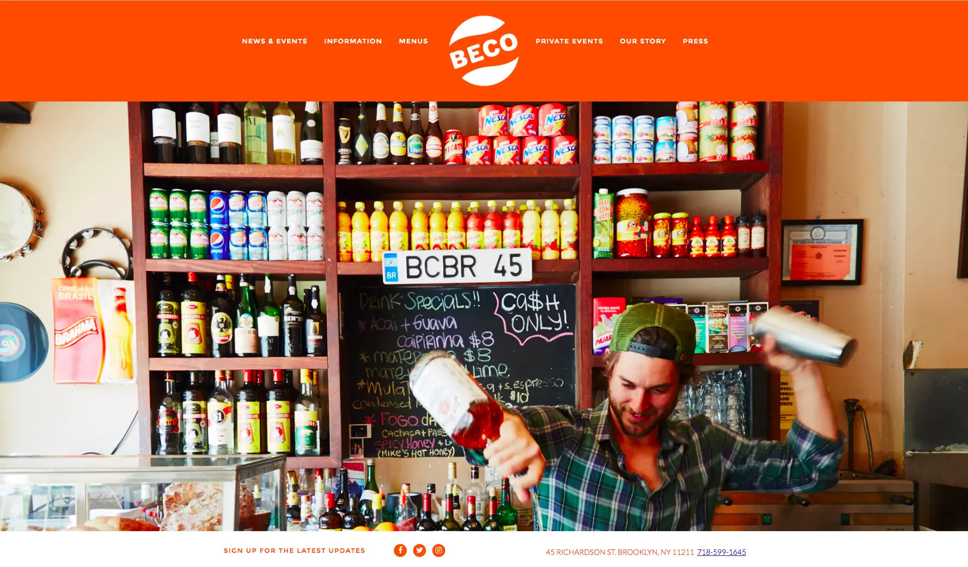
Beco's beautiful, fun, and enticing homepage imagery.
Know What to Look For.
Stunning, high-quality shots of your food, ingredients, or food prep will captivate guests and take your website far.
Photos of composed dishes look nice, but also consider including a few shots of food being prepared and of various ingredients, especially if your menu changes often. The food should look appetizing, too—check out some tips from the food styling pros here.
If you’re on a tight budget, hire a student or aspiring professional to take the photos for you in exchange for a free meal or class credit. If you’re unsure of where to find a photographer, search the internet, ask a friend, or ask us for some suggestions. Still stuck? Search your restaurant's Instagram location to see who's been taking high-quality photos of your food. You could offer them a free meal in exchange for more great photos of your restaurant. Get creative!
Get the Right Specs.
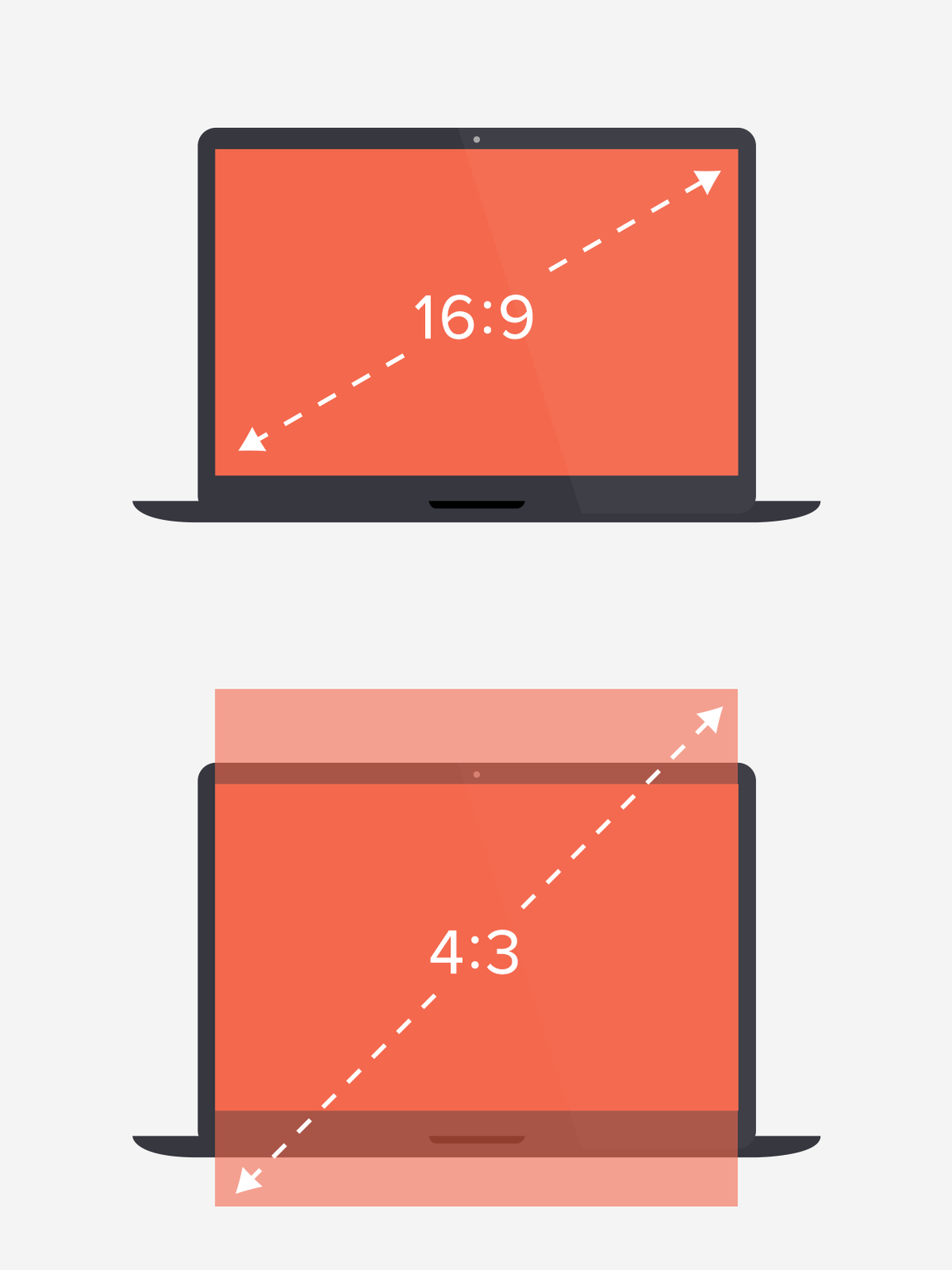
Vertical images need to fit a horizontal, desktop screen.
The benefit of hiring a photographer is that you can tell them these photos are for a website. Ask them to shoot horizontally, with the bulk of the content in the center of the frame, which will prevent awkward cropping and zooming in of photos. You can also ask them to save the images in the right file formats (.jpeg and .png), at a size of less than 500 kb (kilobytes). The point of horizontal, center-focused photos is to ensure that your images look good across all devices—phones, tablets, laptops, and desktops.
The aspect ratio of an image describes the proportional relationship between its width and its height. Historically, horizontally oriented photography has been at a 4 by 3 (4:3) aspect ratio. However, most computer and smartphone screens are closer to a 16 by 9 (16:9) aspect ratio, which is wider than 4:3. In order to achieve the full-screen imagery that is so popular online these days, a 4:3 photo needs to be zoomed in to be able to span the width of the device screen.
Use Meaningful Photos.
Just as your website shouldn’t be overloaded with text, it shouldn’t be packed with photos. Every picture you use on your website should serve a purpose, whether it’s showcasing the food, the restaurant’s exterior so guests know what to look for, or the interior with people in it so that your space looks lively and welcoming. If you want to be sensitive to privacy concerns, make the people in the photos slightly blurred or take the photos during friends and family service.
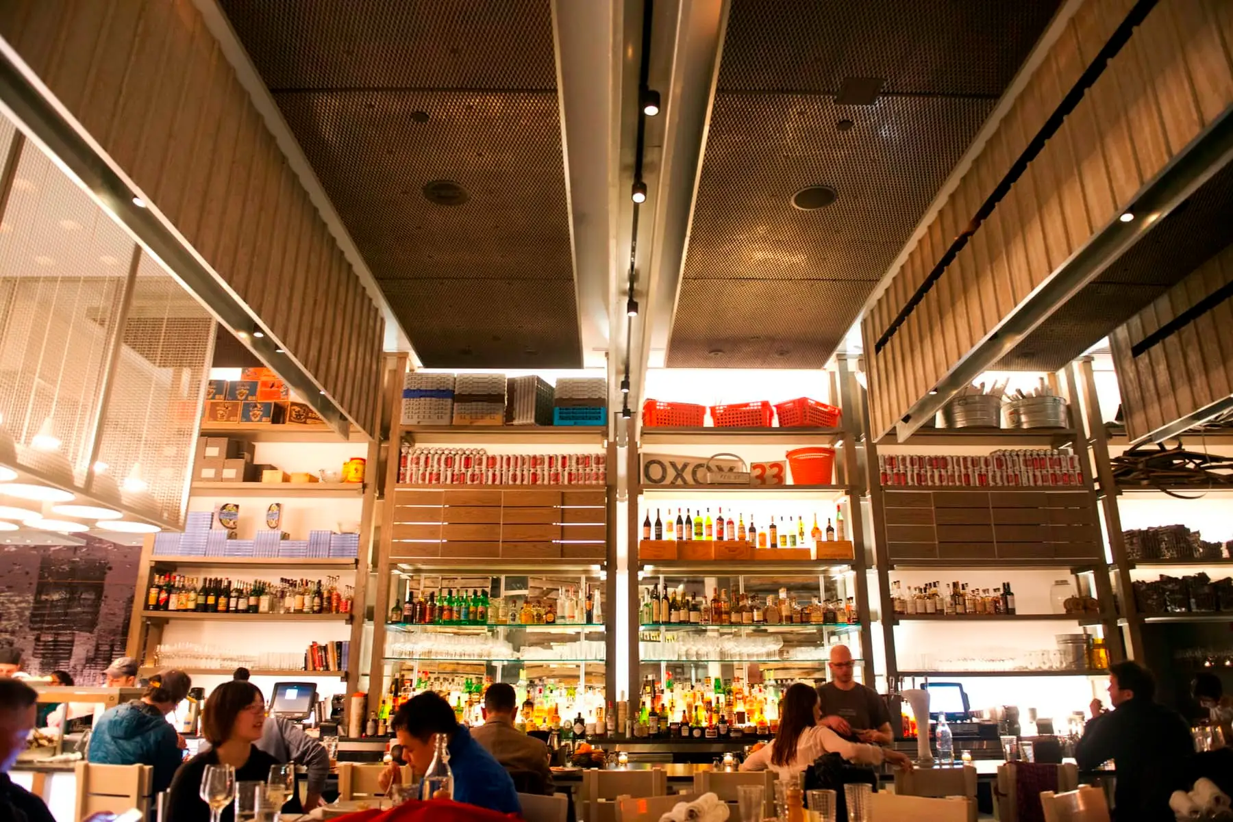
The interior of Island Creek Oyster Bar Boston featured on their website.
It’s better to have a handful of beautiful photos that capture the feel of your restaurant than overwhelming your website with low-quality images just for the sake of filling up space. Before uploading an image to your site, pause and ask yourself what purpose it serves. Is it contributing to your restaurant’s story? Is it emphasizing your brand? Each image should have meaning behind it. If it doesn’t, get rid of it. The design and layout of your website are the bones to your website, but the images are what makes it come alive.

BentoBox Marketing & Commerce Platform
Deliver Smarter Hospitality
Want to stand out online, bring in more money, engage your diners, and streamline operations?
Recommended
New Openings
Restaurant Branding: From Dish Names to Interior Design
July 6, 2023
A guide to creating a strong restaurant brand that attracts and retains diners.
