
Websites
Best Restaurant Website Design Trends
November 1, 2018
A visual roundup of the biggest restaurant website design trends from this year
Your restaurant’s website is a great source of information for guests, but you also want to make sure it reflects your brand and looks good! Design elements and accents can help with this by adding subtle details to make your look more unique.
Last year, we listed some best practices to follow when planning design features for your restaurant's website. This time, we've rounded up some of the biggest visual trends we’ve seen on restaurant websites in 2018 to give you some design inspiration.
Illustrated Accents
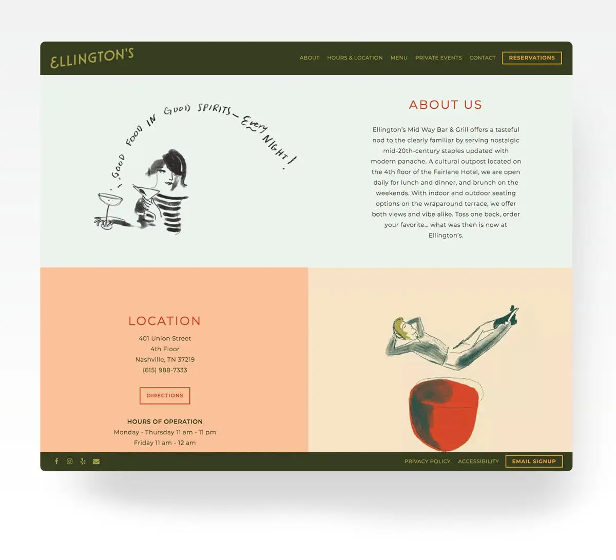
Ellington’s incorporates a feeling of lively sophistication to their website with hand-sketched drawings.
One trend that we’re seeing a lot this year is the addition of illustrations to restaurants’ websites and as a part of their branding. They can add pattern and whimsy to the overall design of a website and may be used to break up long pages with moments of flair. Illustration styles can vary from cartoon drawings to realistic renderings and more. If your restaurant concept has a specific theme, illustrations can help convey it while adding interesting and eye-catching designs to your website.
Natural Textures
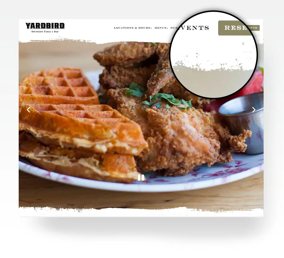
Yardbird’s paper-like background features distressed edges for added texture.
Another trend we've seen is the use of natural or distressed elements. This can include things like wood, paper, and other rustic textures. They can be used as a design option that helps break up clean lines and flat colors, or by restaurants who want to convey a down-to-earth, homey atmosphere online.
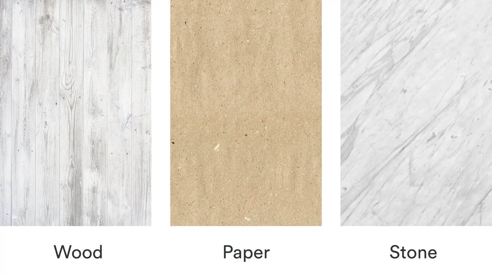
Examples of textures that resemble natural elements like wood, paper, and stone.
Stylized Borders
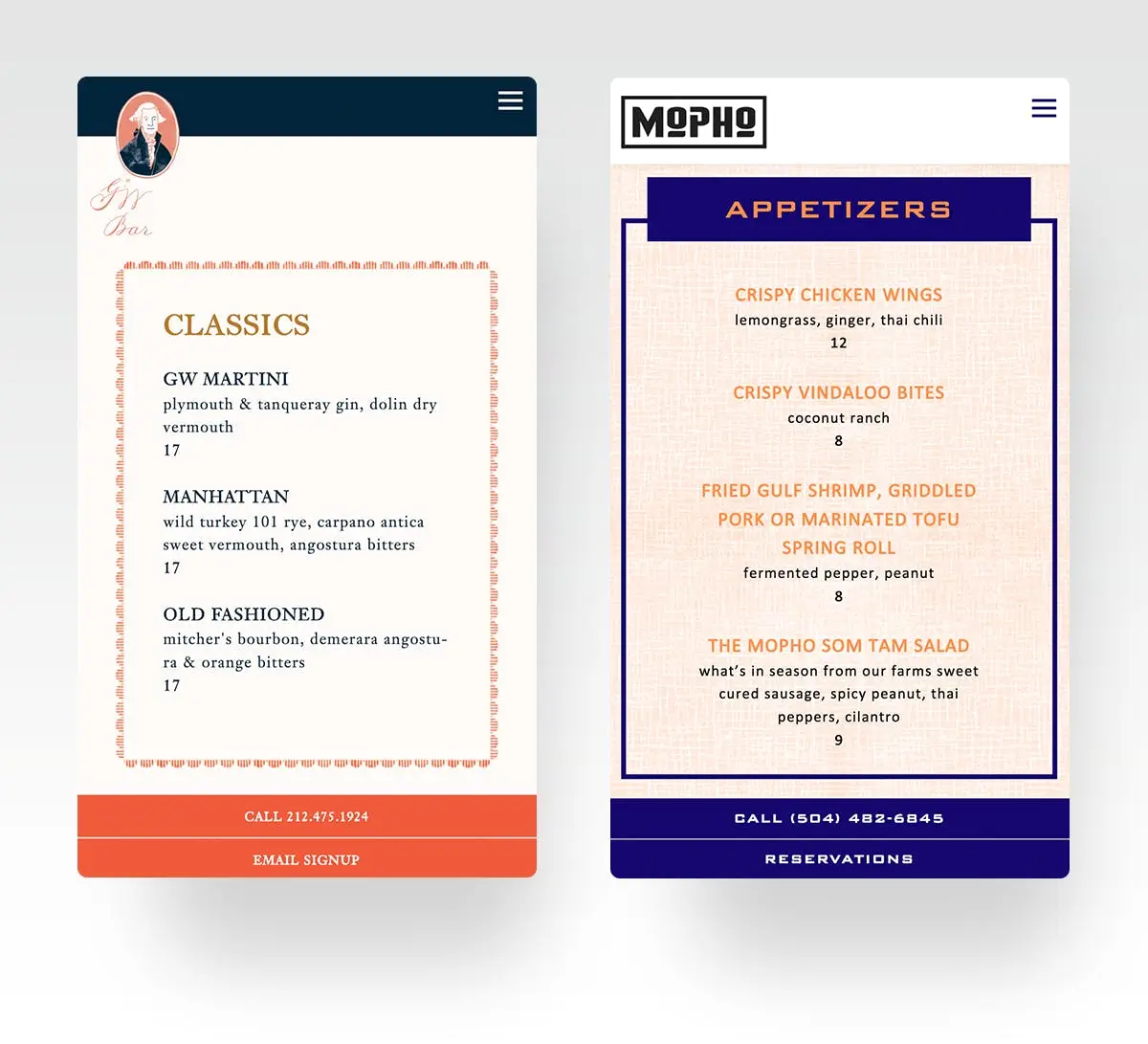
The bordered menus on both the George Washington Bar & Mopho’s s websites separate information while adding flair.
Pages with a lot of information, like online menus, can often be difficult to organize with so many items to display. The use of stylized borders adds charming elements to your restaurant’s website while establishing sections for floating information.
While design trends can come and go, the key to adding stylized design to your restaurant's website is to give visitors a great sense of your what your place is all about and to get more guests through its doors. It's an opportunity to have some fun with your brand and find unique ways to carry your restaurant's message to the world online.
Unsure of where or how to start the process of designing your restaurant's website? Get in touch with our team today!
Recommended
BentoBox News
Behind the Scenes of BentoBox’s New Branding
October 3, 2018
How and why we updated our visual identity
Design Inspiration
Restaurant Website Inspiration for 2020
January 22, 2020
A look at some of our favorite restaurant websites, before & after BentoBox.

Design Inspiration
The Best Minimalist Restaurant Websites
May 11, 2017
A roundup of our favorite minimalist restaurant website designs.