Marketing
22 Best Restaurant Logos to Inspire Your Design
January 11, 2023
Take a look at successful restaurant logo examples, and read about why they work.
When you’re preparing for a new restaurant opening, creating a logo for your restaurant is a pivotal design choice. The type of concept you’re building, the food you’ll be offering and the diners you want to attract are all part of the decision-making process for a logo. A fast casual vegan concept will have a very different logo than an upscale fine dining establishment serving Mediterranean small plates.
From understanding the four key components of a good restaurant logo to over two dozen visual examples of awesome logos from real restaurants, here’s what you need to know about logo design in order to bring your own to life.

RESOURCE
A Guide to Restaurant Branding
Find prompts and questions to help you define your brand, and discover how to bring it to life.
What makes a good restaurant logo?
A good restaurant logo has four major elements. You want a design that’s simple, legible, memorable and relevant to your concept. Read below for more details on each consideration.
1. Simple
The average human attention span is 8.25 seconds, meaning that intricate and detailed logo designs are too much to process. A quick glance at a logo should be enough time to absorb the information. There’s no need to overcomplicate it.
2. Legible
Calligraphy-inspired fonts and elaborate taglines may look beautiful, but they can’t come at the expense of readability. If the letters in your restaurant name are too close together or too far apart, it can be challenging to make out the word. Likewise, fonts that are too small can be tough to decipher, as can certain cursive font styles.
3. Memorable
Good logos are ones that people can recall. Creating memorability is a delicate balance between a unique and recognizable design. A logo that stands out and is distinguishable will lead to a stronger connection with your brand and ultimately generate more customers.
4. Relevant
Lastly, your logo needs to make sense for your concept. The colors should be consistent with your overall branding. The font should support the overall look and feel you’re aiming for. The design should be appropriate for the aesthetic you’re creating.
Successful Restaurant Logo Examples
PLNT Burger
Various Locations Across the East Coast | www.plntburger.com

Vegan fast casual restaurant PLNT Burger from Top Chef alum Spike Mendelsohn brings its plant-based ethos to life in its logo created by T Creating Co. Whether you see “a burger, a sunset or a mountain,” the design reflects the food that’s served as well as an ode to nature. The vibrant color palette of yellow, teal, red and purple extends to the menu and packaging and makes its way to merchandise as well.
Bar Enza
Cambridge, Massachusetts | www.bar-enza.com

Bar Enza’s logo is playful and energetic yet simple and easy to read. This Neo-Trattoria just outside of Boston incorporates triangles into its design with embellishments on the E and A and bold triangular cutouts on the N and Z, which emphasize the letter’s shape. The red and yellow coloring feel fittingly Italian and evoke the hues of sauce and noodles.
Veronika
New York, New York | www.veronikanyc.com

Nestled inside the Swedish photography museum Fotografiska in New York City, Veronika needed a logo that represented the restaurant’s ambiance — something sophisticated, sexy and striking. This beautiful typography-based logo depicts an upscale experience with a unique font and tight kerning. Plus, the tall letters in the logo mimic the two-story windows in the space. The lengthiness (in both cases) ties together the digital and physical branding and creates a subtle elegance.
Betelgeuse Betelgeuse
Houston, TX | www.betelgeusehou.com

Named after the bright red supergiant star in the Orion constellation, Betelgeuse Betelgeuse is a nod to Houston, TX’s connection to space. The intergalactic motif takes shape in the logo through bright colors, a funky illustration in the center and a spinning outside ring featuring the restaurant’s name that gives off a solar system vibe.
House of Better
Calistoga, California | www.houseofbetter.com

This Napa Valley spot positions itself as a “fresh take on wellness and happiness” where health food meets comfort food. The circular elements of the logo are reminiscent of the menu, which features round eats like a tasting flight of dips, stews, grain bowls and pies. Additionally, the bubble-like nature of the design speaks to what’s being brewed right on site like housemade tonics, kombucha and adaptogen teas.
Elephante
Santa Monica, California | www.elephantela.com

This Santa Monica hotspot is named for an elephant-shaped rock structure on the coast of Italian island Pantelleria called Arco dell’Elefante. The concept incorporates touches of Southern Italy and Northern Africa into the decor with handmade terracotta tiles, stone covered bars and wooden espresso machines. In the logo, these influences are highlighted with the color palette featuring earthy shades. The bold title font with offset angles and rounded edges is juxtaposed against an artistically crafted, layered elephant. These elements work together nicely, especially on Elephante’s merchandise.
Yonutz
Various Locations Across the United States | www.yonutz.com

Yonutz is a gourmet dessert spot serving milkshake and ice cream-filled donuts, and its logo is a perfect fit for the creative concept. With two shades of bright pink and an exclamation point on the end, the design screams fun and playful. The lighter coloring on the font surrounded by a darker shade even creates the illusion of an ice cream filling.
Solomon's
Sacramento, California | www.solomons.co
Solomon’s is a Jewish deli from Tower Records founder Russ Solomon. The concept is housed in the space where the sixth store of Tower Records once sat, and the logo pays tribute to that history with a record-esque design. Inside the concentric circles sits a bagel-like image that’s been split in two and shifted to create a unique looking S (for Solomon’s). Super colorful, recognizable and versatile, this logo is a great representation of its concept.
Bar Francis
Brooklyn, New York | www.barfrancisnyc.com
With a retro font and dramatic drop shadow, this logo is the perfect branding for the swanky Brooklyn cocktail bar. The drop shadow effect plays out across the navigation and page headers on the Bar Francis website. The simple color choices of black and cream in the logo speak to the elegant, polished feel of the concept and those colors are reflected in the interior design of the space too.

PRODUCT
Websites for Restaurants
Get a beautifully designed website with tools to grow your business.
Blue Ocean
St. Louis, Missouri | www.blueoceanstl.com

Japanese eatery Blue Ocean’s logo features a simple yet elegant wave in its design. The aquatic feel speaks to both the restaurant’s name and menu, which is seafood-heavy. Overall, it leaves diners captivated with an interesting composition and refined color palette.
ASTRA
Miami, Florida | www.astramiami.com

Here’s a nice take on what otherwise would be a simple font logo. The splitting of the A and R adds interesting white space to the design and makes it feel more open, which is fitting as ASTRA is an open air rooftop terrace. The logo is polished yet progressive, just like the concept it represents.
Escondido
Dallas, Texas | www.escondidodallas.com
Husband and wife owners Jon and Natalie Alexis wanted to open a Tex-Mex neighborhood spot that was equal parts funky and family-friendly. With Mexican tiles, floral decor, Otomi folk art and string lights inside the space, it was important that those key attributes of color and playfulness come through in the logo. The main design features facing llamas, and you’ll find different animal illustrations scattered throughout their website (check out the chickens on the menu page). It’s apparent from the logo that this place is a big ol’ party.
Grumpy Dumpling Co.
Norwalk, Connecticut | www.grumpydumplingco.com
Farmers market goers in Connecticut’s Fairfield County are likely familiar with the Grumpy Dumpling Co.’s logo, which is quite literally a grumpy dumpling. The name was inspired when husband-and-wife owners were making dinner one night in a slightly bad mood, prompting one of them to call the other a “grumpy dumpling.” The logo was drawn by Japanese street artist Blaster Matsushita, and lends itself well to a fun animation on the company’s website along with a neat hover effect over links.
Belles Beach House
Venice, California | www.bellesbeachhouse.com

Belles Beach House in idyllic Venice, CA, is an ode to the retro Tiki Bar, serving Haiwaiian-inspired bites with slight Japanese influence and hand-crafted cocktails. The vibe is laid back, island-y and escapist, and its bold logo brings that feeling front and center. What’s important here is the legible font paired with an artsy icon, proving that clear and unique can go hand-in-hand.
Champagnes Kitchen
Newport Beach, California | www.champagneskitchenoc.com

Champagnes Kitchen takes the first letter of its name and pulls it into its icon along with a creative interpretation of a fork and grain. The concept is a family-owned bistro, which is clear from one quick look at the logo. Overall, the design has good composition with contrasting colors and a mix of innovative design and straightforward font.
Bar Dalia
Astoria, New York | www.bardalia.nyc
This boutique bar serving tapas and craft cocktails needed a logo to stand out from the exterior of its brown brick building. The two-toned green colors make it pop and feel like an emblem of sorts. The use of texture in the logo extends to Bar Dalia’s website design too (take a peek at the background pattern). There’s a clear brand identity that extends to drink coasters, merchandise and signage.
Katherine
New York, New York | www.katherinenyc.com

Elegant, chic and modern are a few words that come in mind when seeing both Katherine’s logo and space. The K icon weaves in a martini to the design, clearly connecting the design to the cocktail bar concept. The star accents that dot the top and bottom of the logo are incorporated into the website for flair when you hover over a link in the side navigation.
Daisies
Chicago, Illinois | www.daisieschicago.com
The logo for veggie-forward, pasta-focused Daisies is simple, straightforward and sleek. The restaurant’s name is a nod to chef-owner Joe Frillman’s grandmother, who was nicknamed Daisy. The design is feminine and fresh, which speaks partly to the concept’s namesake and also shouts out the farm-to-table sourcing in the kitchen.
Tortazo
Chicago, Illinois and New York, New York | www.tortazo.com

Tortazo is a fast casual Mexican spot from chef Rick Bayless serving tortas, bowls, quesadillas, salads and snacks. Vibrant, bold and warm is how the concept is aiming to come across, and those elements shine through in its logo. Bright colors are traditional in Mexican art and design and the usage in the logo speaks to the knowledge Bayless holds about the culture. In fact, he was awarded the Order of the Aztec Eagle from the Mexican government, which is the highest decoration bestowed on foreigners whose work has benefitted Mexico and its people.
Buttermilk & Bourbon
Boston, Massachusetts | www.buttermilkbourbon.com
This Southern-inspired concept pulls from New Orleans culture for its interior design and menu. On the logo, a voodoo eye font attracts attention on the bottom with a stretched, stringy font on top. Clean lines are present throughout the design, especially in the center of the logo and surrounding the outer edge. These lines follow onto the restaurant’s website, framing section titles and living under hyperlinks.
Spice Finch
Philadelphia, Pennsylvania | www.spicefinchphilly.com
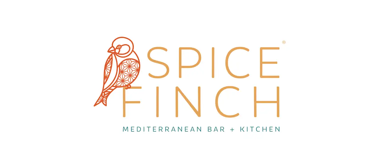
Vibrant and energetic yet timeless and classic, Spice Finch’s logo perfectly encapsulates the Philadelphia concept. The color palette of yellow, red and teal takes inspiration from images of Mediterranean spices, tiles and textiles. The logo appropriately features a literal spice finch (a type of bird), and the pattern within it was influenced by a popular spice in Mediterranean dishes: star anise.
Traveler's Table
Houston, Texas | www.travelerstable.com
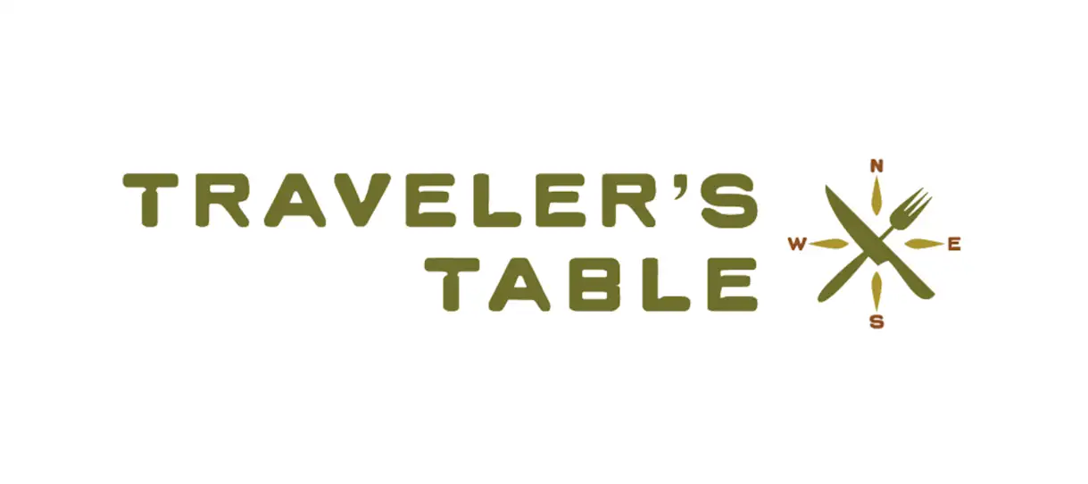
Traveler’s Table’s branding of being a “globally-inspired eatery” is summed up cleverly and clearly in the restaurant’s logo. With a crossed fork and knife paired against a compass, the two words “global” and “eatery” are both represented.

BentoBox Marketing & Commerce Platform
Want to stand out online? Let's chat.
Drive revenue directly through your website.
Recommended
New Openings
32 Instagrammable Restaurant Decor Ideas
August 25, 2022
This round-up of decor inspiration is all you’ll need to level up your restaurant.
Marketing
How to Write a Restaurant Marketing Plan [Free Template]
June 24, 2021
Help your restaurant stand out and appeal to more guests with this in-depth marketing plan template.
New Openings
The Ultimate Guide to Restaurant Name Ideas
July 13, 2022
What’s in a name? A lot of brainstorming, sweat and tears. Learn how to create a great restaurant name.
