Design Inspiration
Website Inspiration: 20 Great Restaurant Description Examples
January 6, 2022
You never get a second chance to make a first impression. Now more than ever, it happens on your restaurant's website.
Restaurants know the importance of a strong first impression. It's why they invest in exterior design, decorate their entranceways and train hosts to welcome guests with a warm smile.
Nowadays, however, more than 70% of diners visit a restaurant's website before deciding where to dine, which means the first impression happens long before they set foot on-premises. It happens online. And when it does, the restaurant description plays a pivotal role.
Despite this, many restaurants struggle to write an effective description for their website. Doing so requires a mix of skills not every restaurant has — writing, design and a keen understanding of digital user behavior — but there are tools in place to make the job easier. For example, if you build your website with BentoBox, full-service designers can help create your website on a template that is proven to be user-friendly. That takes care of the design and user behavior hurdles.
To help overcome the writing hurdle, we've created the resource below. In addition to defining best practices, we have curated 20 examples of effective restaurant descriptions and analyzed why they work. If you don't know where to start or feel stuck, scroll through these examples and see if they spark new ideas.
How Do You Write an Online Restaurant Description?
A good restaurant description needs to make a strong first impression on would-be diners. This means the writing should be grammatically sound and typo-free — but it also means the content should make strategic sense for your brand. There are several keys to doing this correctly:
Define your objective. As you'll see in the examples below, descriptions that work for some restaurants would fall flat for others. A cocktail lounge might want its description to be a call to adventure, while a sandwich shop might simply want to say it has the lowest prices in town. Define the main thing you want your audience to know or feel, then use that as a north star to guide your writing.
Outline key points. Now that you know your objective, write down all the key messages you want to communicate. Sort them into tiers of importance, and be honest about what is "nice to know" versus what is "need to know." Digital attention spans are short, so if you try to include every selling point — rather than just the essentials — readers will gloss over your description. The more information you ask them to retain, the less they actually will.
Consider the visuals. As you determine the best way to communicate "need to know" messages, remember that text is not the only way to communicate. Many of the examples below use design and photography to reinforce their key selling points. This reduces how much text you need and helps solve the attention span issue mentioned above, but to do it correctly across devices, you'll need a well-designed website platform.
Edit & ask for feedback. There's a famous saying in the writing industry: "writing is rewriting." In other words, your first draft always needs work, and the real craft of writing comes in making that first draft better. When you have something down, read it over for typos but also play around with different word choices and sentence structures. Ask people you trust for feedback. If you do this well, you'll only have to do it once. It's worth investing a little extra time.
The examples below are designed to help with this process. It may be helpful to bookmark this page and refer to them while you write and edit. Or, you can view them all now and see if any stand out as starting points.

RESOURCE
20 Inspiring Restaurant Website Designs
Design inspiration for your restaurant’s digital storefront.
Restaurant Description Examples: With Headlines
The first 10 examples use headlines, or bold text above the main description, in rhetorically interesting ways. Headlines are optional in restaurant descriptions, but when used right they capture attention and reinforce key messages.
1. Bubby's
Description Text
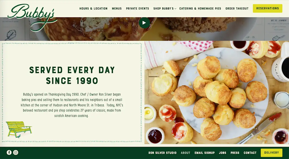
SERVED EVERY DAY SINCE 1990
Bubby’s opened on Thanksgiving Day 1990. Chef / Owner Ron Silver began baking pies and selling them to restaurants and his neighbors out of a small kitchen at the corner of Hudson and North Moore St. in Tribeca. Today, NYC’s beloved restaurant and pie shop celebrates 27 years of classic, made from scratch American cooking.
Why It's Effective
Rather than calling itself a “New York institution” or using the word "reliable," Bubby’s uses its headline to make a specific claim — ”Served every day since 1990” — that demonstrates those ideas. This captures more attention and paints a richer, more vivid picture of its history and role in the community. The rest of the description supports this by adding details to the story of its founding and explaining that even three decades later, its scratch approach to cooking remains the same.
2. Old Ebbitt Grill
Description Text (abridged)
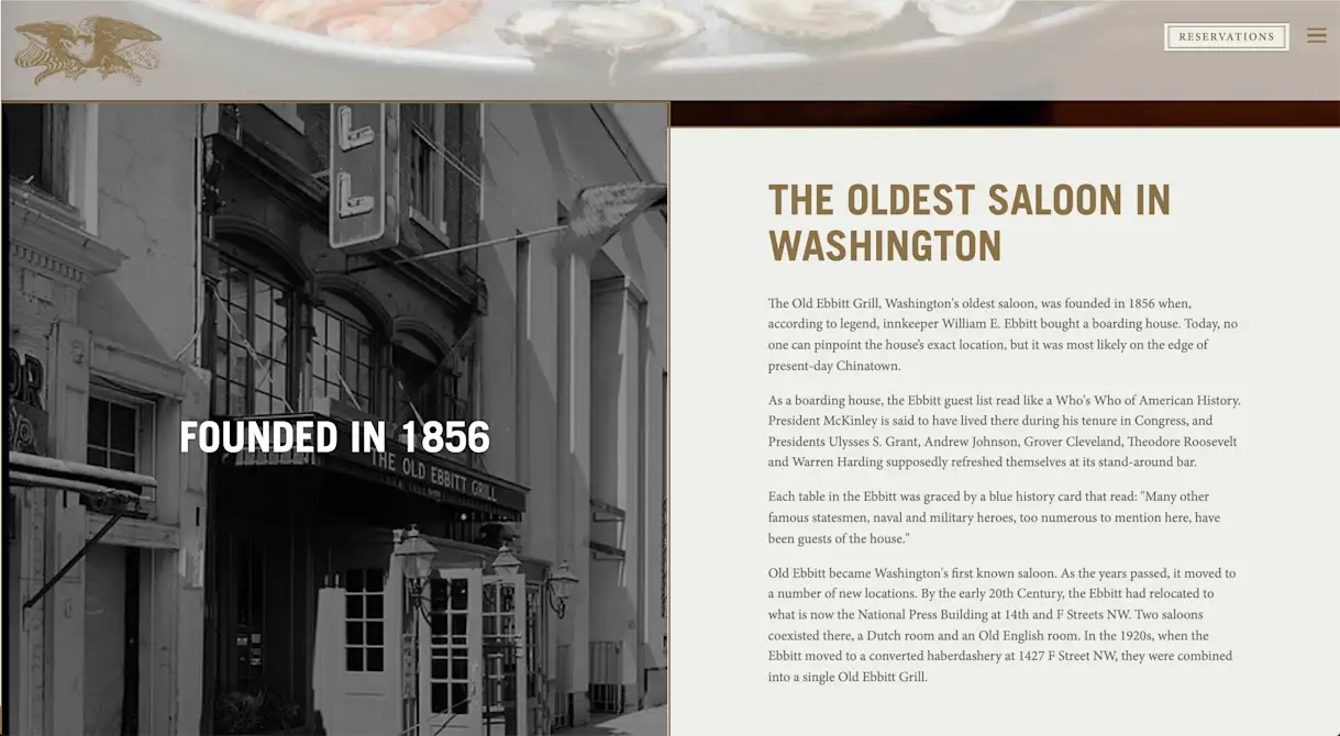
THE OLDEST SALOON IN WASHINGTON
The Old Ebbitt Grill, Washington's oldest saloon, was founded in 1856 when, according to legend, innkeeper William E. Ebbitt bought a boarding house. Today, no one can pinpoint the house’s exact location, but it was most likely on the edge of present-day Chinatown.
As a boarding house, the Ebbitt guest list read like a Who's Who of American History. President McKinley is said to have lived there during his tenure in Congress, and Presidents Ulysses S. Grant, Andrew Johnson, Grover Cleveland, Theodore Roosevelt and Warren Harding supposedly refreshed themselves at its stand-around bar.
Why It's Effective
Like Bubby's, Old Ebbitt Grill uses its headline to make a specific claim that paints a vivid picture. This claim — "The oldest saloon in Washington" — is even bolder and more eye-catching, especially with the black-and-white photo beside it. The description delivers on the promise of the headline, listing the U.S. presidents who have frequented the famous saloon. Instead of explicitly stating, "Old Ebbitt Grill has a rich history," this approach paints a picture that helps people feel the history.
3. Cutlets
Description Text
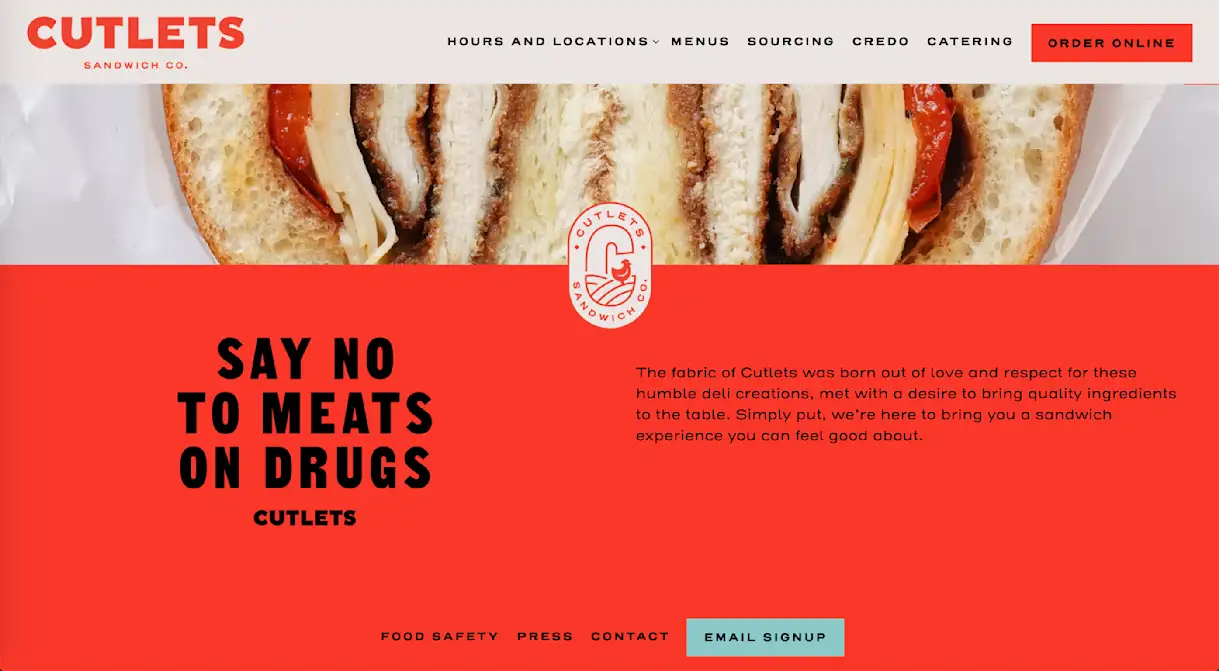
SAY NO TO MEATS ON DRUGS
The fabric of Cutlets was born out of love and respect for these humble deli creations, met with a desire to bring quality ingredients to the table. Simply put, we’re here to bring you a sandwich experience you can feel good about.
Why It's Effective
This headline — a parody of the 1980s-era Just Say No campaign — does three important things simultaneously:
Captures user attention.
Establishes the brand as fun & playful.
Introduces a key selling point of the restaurant (natural ingredients).
It's rare for one line of copy to accomplish so much so quickly, but when it happens, it's extremely powerful. Cutlets combines this description with a carousel of high-resolution food photography, which rounds out the homepage and leaves a strong impression on future diners.
4. Los Tacos No. 1
Description Text
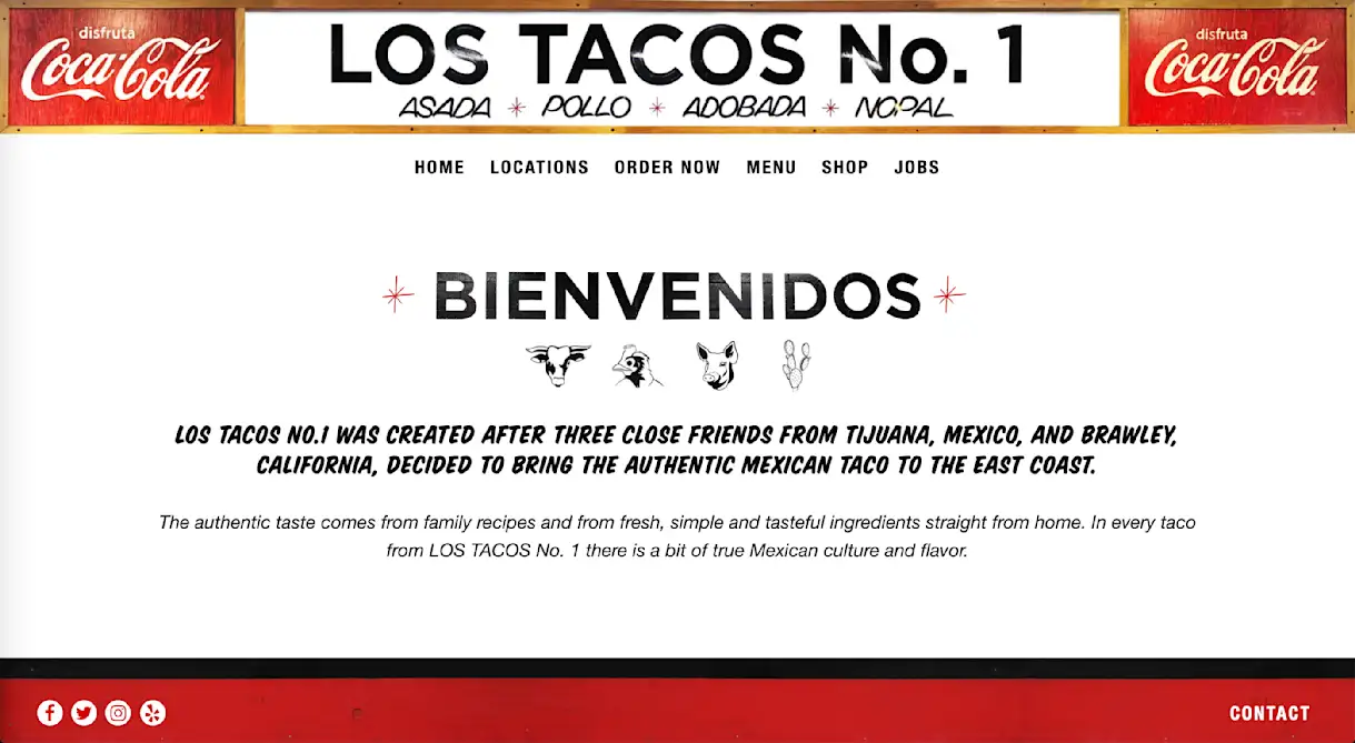
BIENVENIDOS
Los Tacos No. 1 was created after three close friends from Tijuana, Mexico, and Brawley, California, decided to bring the authentic Mexican taco to the east coast.
The authentic taste comes from family recipes and from fresh, simple and tasteful ingredients straight from home. In every taco from LOS TACOS No. 1 there is a bit of true Mexican culture and flavor.
Why It's Effective
The headline welcomes guests in Spanish, and then the description switches seamlessly to English. This is a fitting introduction to Los Tacos No. 1, the brainchild of partners from both sides of the Mexican-American border, who brought their authentic recipes to New York City. The illustrations between the headline and description represent the four fillings on their menu — beef, chicken, pork and cactus — and channel the restaurant’s lighthearted character. Click the link above and you’ll see that the icons animate when users scroll past them, one of many cool design features available through the BentoBox website platform.
5. Ci Siamo
Description Text
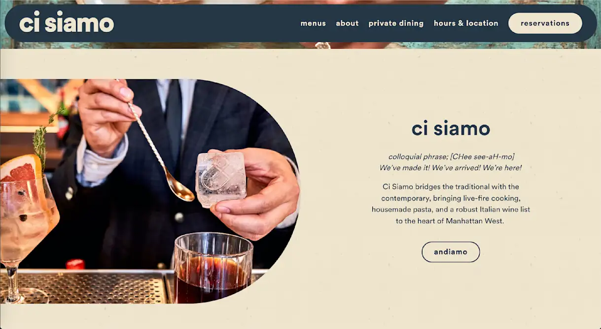
ci siamo
colloquial phrase; [CHee see-aH-mo]
We’ve made it! We’ve arrived! We’re here!
Ci Siamo bridges the traditional with the contemporary, bringing live-fire cooking, housemade pasta, and a robust Italian wine list to the heart of Manhattan West.
Why It's Effective
Ci Siamo begins its description by translating its name into English, mimicking the style of a dictionary. It could have written something straightforward like, "Ci Siamo is Italian for 'We've made it! We've arrived! We're here!,' but the dictionary tactic adds a playful twist on top of that. This is important because Ci Siamo is not a strictly traditional brand; it's a brand that seeks to "bridge the traditional with the contemporary." Thanks to its description, that comes across loud and clear.

PRODUCT
Websites for Restaurants
Get a beautifully designed website with tools to grow your business.
6. Baba's
Description Text
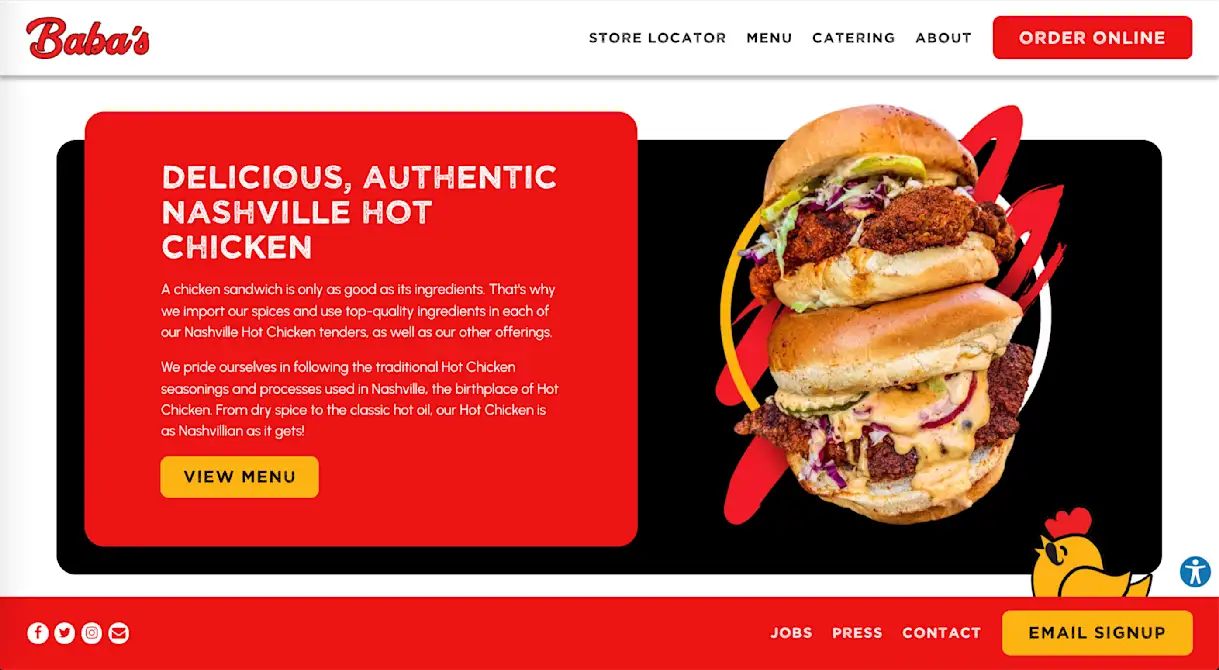
DELICIOUS, AUTHENTIC NASHVILLE HOT CHICKEN
A chicken sandwich is only as good as its ingredients. That's why we import our spices and use top-quality ingredients in each of our Nashville Hot Chicken tenders, as well as our other offerings.
We pride ourselves in following the traditional Hot Chicken seasonings and processes used in Nashville, the birthplace of Hot Chicken. From dry spice to the classic hot oil, our Hot Chicken is as Nashvillian as it gets!
Why It's Effective
Baba's is a Nashville hot chicken chain that operates across California. In nearly every sentence, the headline and description on its homepage stress that it is authentic Nashville hot chicken — not some cheap West Coast imitation. When your restaurant has a well-defined value prop like this, the description is no place for subtlety; you want to hammer it clearly, concisely and continuously. Baba's does this with text and then validates it with loud, in-your-face, food photography.
7. Teranga
Description Text
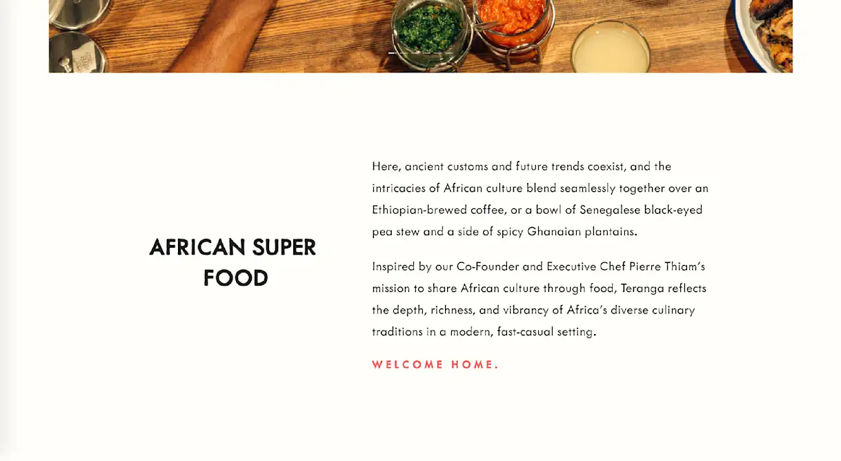
AFRICAN SUPER FOOD
Here, ancient customs and future trends coexist, and the intricacies of African culture blend seamlessly together over an Ethiopian-brewed coffee, or a bowl of Senegalese black-eyed pea stew and a side of spicy Ghanaian plantains.
Inspired by our Co-Founder and Executive Chef Pierre Thiam’s mission to share African culture through food, Teranga reflects the depth, richness, and vibrancy of Africa’s diverse culinary traditions in a modern, fast-casual setting.
WELCOME HOME.
Why It's Effective
After capturing attention with the headline, the first sentence of the description gives three examples of menu items, each one using a different African country in the adjective: Ethiopian-brewed coffee, Senegalese black-eyed pea stew, Ghanaian plantains. This is a deft illustration of the menu concept, which blends the diverse tastes of African cuisine into one cohesive experience. The description also ends with an inviting piece of copy, "Welcome Home," that stands out due to colorful text design.
8. PLNT Burger
Description Text
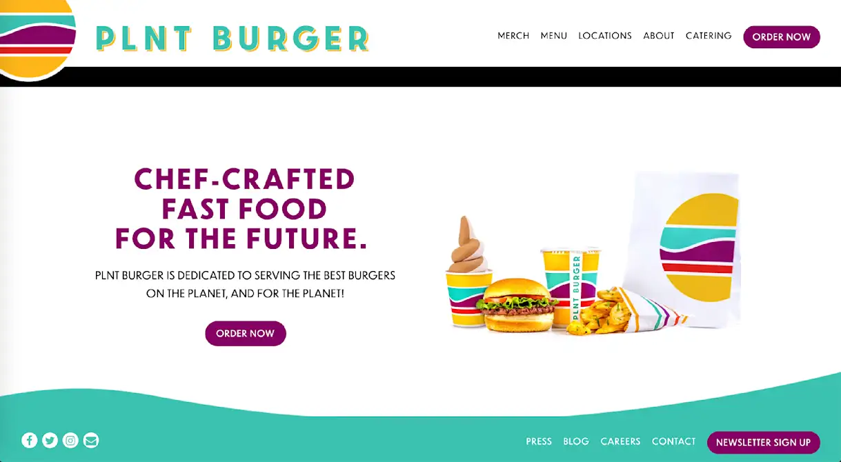
CHEF-CRAFTED FAST FOOD FOR THE FUTURE.
PLNT Burger is dedicated to serving the best burgers on the planet, and for the planet!
Why It's Effective
Earlier, we mentioned the importance of separating "need to have" messages from "nice to have" messages. No restaurant on this list does that better than PLNT Burger, which communicates its value prop and establishes a cheeky brand voice in two short lines of copy (three if you count its name). Rather than bogging down its homepage with details and specifics, the plant-based fast-food chain shares a simple, compelling message about what it offers and why, along with a clever play on words. If users want to learn more, the About page linked in the main navigation has them covered.
9. The Green Room
Description Text
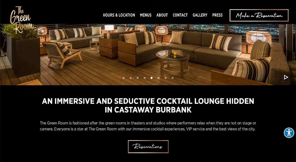
AN IMMERSIVE AND SEDUCTIVE COCKTAIL LOUNGE HIDDEN IN CASTAWAY BURBANK
The Green Room is fashioned after the green rooms in theaters and studios where performers relax when they are not on stage or camera. Everyone is a star at The Green Room with our immersive cocktail experiences, VIP service and the best views of the city.
Why It's Effective
The headline leads with descriptive words like "immersive," "seductive" and "hidden," which draw the user in and make them want to learn more. The description then delivers on that intrigue, explaining that the lounge is fashioned after backstage green rooms in theaters and on movie sets. That's a bold claim, but the full-bleed photos of the restaurant's sprawling views, along with the gold trims and fonts throughout the website, help position The Green Room as a place where regular people feel like stars.
10. She Wolf Bakery
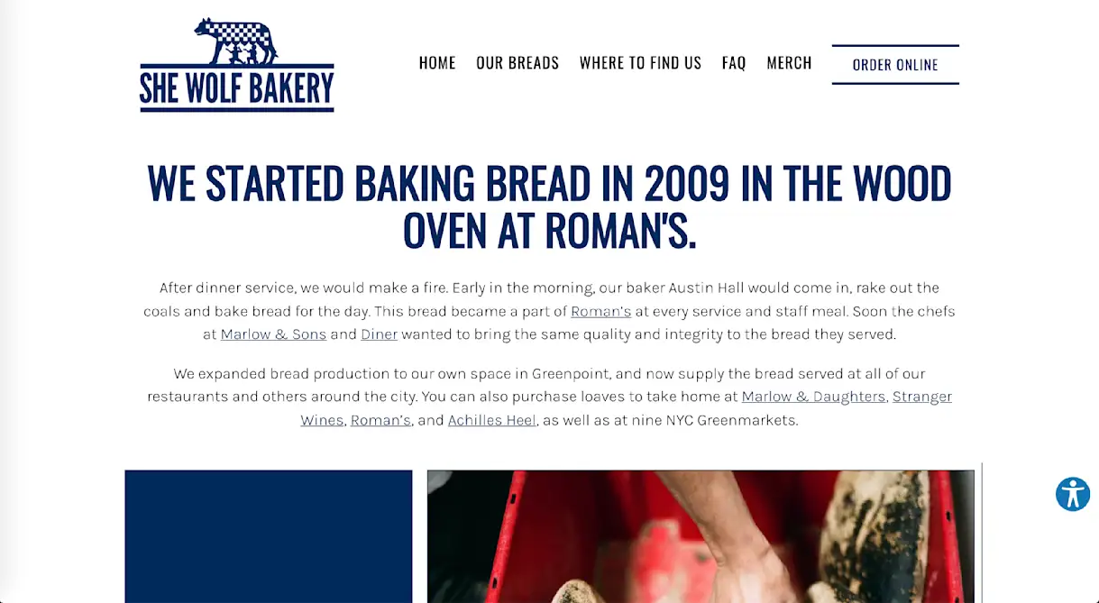
Description Text WE STARTED BAKING BREAD IN 2009 IN THE WOOD OVEN AT ROMAN'S.
After dinner service, we would make a fire. Early in the morning, our baker Austin Hall would come in, rake out the coals and bake bread for the day. This bread became a part of Roman’s at every service and staff meal. Soon the chefs at Marlow & Sons and Diner wanted to bring the same quality and integrity to the bread they served.
We expanded bread production to our own space in Greenpoint, and now supply the bread served at all of our restaurants and others around the city. You can also purchase loaves to take home at Marlow & Daughters, Stranger Wines, Roman’s, and Achilles Heel, as well as at nine NYC Greenmarkets.
Why It's Effective
This description reads like an origin story, and it's written in a way that perfectly suits the brand. The first-person perspective, natural word choice and short, active sentences make it feel like the restaurant's owners are speaking directly to the audience through the screen. This mirrors the underlying theme of the story: that She Wolf Bakery grew through connection and community, and that you can trust every loaf to have a personal, artisan touch.
Restaurant Description Examples: No Headlines
The next 10 examples either don't use headlines or use them in straightforward ways (e.g., "About Us"). This more minimalist approach can still be effective, though it may require visuals to play a larger role capturing user attention.
11. Gramercy Tavern
Description Text
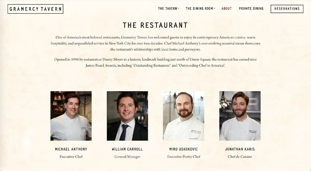
One of America's most beloved restaurants, Gramercy Tavern has welcomed guests to enjoy its contemporary American cuisine, warm hospitality, and unparalleled service in New York City for over two decades. Chef Michael Anthony's ever-evolving seasonal menu showcases the restaurant's relationships with local farms and purveyors.
Opened in 1994 by restaurateur Danny Meyer in a historic landmark building just north of Union Square, the restaurant has earned nine James Beard Awards, including "Outstanding Restaurant" and "Outstanding Chef in America.”
Why It's Effective
Upscale restaurants sometimes overwrite their descriptions, using flowery language that sounds posh and sophisticated but doesn't convey a clear point. Gramercy Tavern uses simple adjectives like contemporary American cuisine, warm hospitality and unparalleled service, which paint a clear picture while still projecting confidence and authority. The use of plain language in the first sentence primes readers for the second sentence, where the restaurant mentions its nine James Beard Awards in a way that feels matter-of-fact and informative, rather than arrogant and showy.
12. Big Gay Ice Cream
Description Text (abridged)
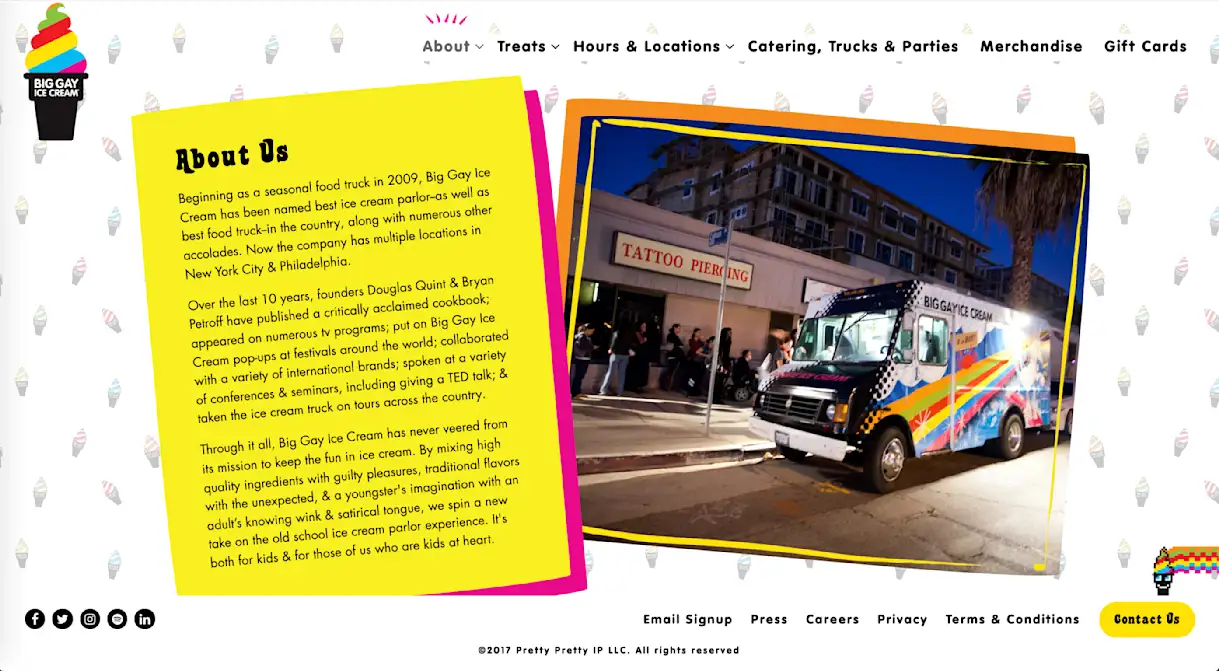
Beginning as a seasonal food truck in 2009, Big Gay Ice Cream has been named best ice cream parlor—as well as best food truck—in the country, along with numerous other accolades. Now the company has multiple locations in New York City & Philadelphia.
Over the last 10 years, founders Douglas Quint & Bryan Petroff have published a critically acclaimed cookbook; appeared on numerous tv programs; put on Big Gay Ice Cream pop-ups at festivals around the world; collaborated with a variety of international brands; spoken at a variety of conferences & seminars, including giving a TED talk; & taken the ice cream truck on tours across the country.
Why It's Effective
Although the style — and the business — is very different, Big Gay Ice Cream employs a similar approach to Gramercy Tavern. The first paragraph of its description explains the brand's humble origins as a seasonal food truck, which primes readers for the second paragraph, where it mentions various milestones and accolades. This description approach and the web page design, which resembles a scrapbook with polaroids, positions Big Gay Ice Cream as it wants to be positioned: a global sensation that remembers where it came from.
13. the girl & the fig
Description Text
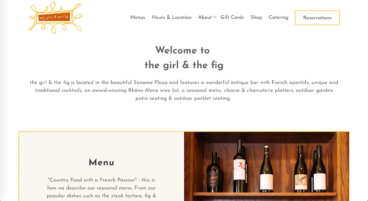
the girl & the fig is located in the beautiful Sonoma Plaza and features a wonderful antique bar with French aperitifs, unique and traditional cocktails, an award-winning Rhône-Alone wine list, a seasonal menu, cheese & charcuterie platters, outdoor garden patio seating & outdoor parklet seating.
Why It's Effective
This description is only one sentence, but it's packed with information. The writing is taut and straightforward, and the long list of restaurant features it lists — seven in total — projects a sense of understated confidence. Had the list of features been shorter, a one-sentence description like this might feel sparse. Instead, it feels quite inviting, like the restaurant believes so strongly in its offerings that it doesn't need to dress them in glittery language.
14. Death & Company
Description Text (abridged)
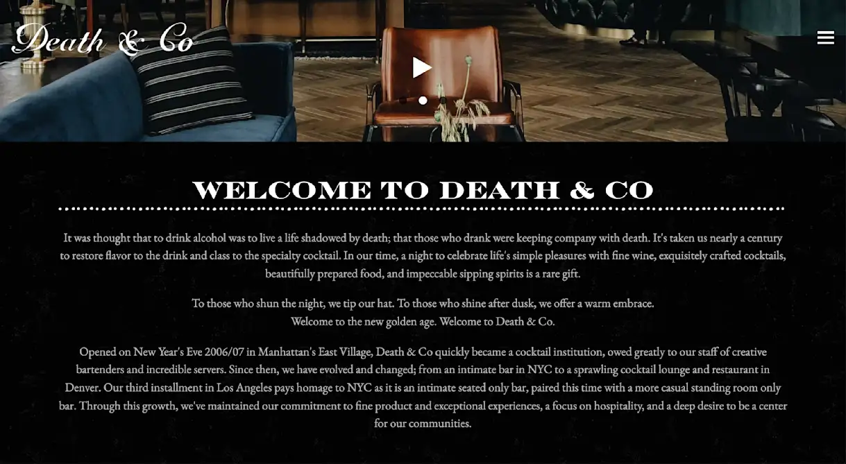
It was thought that to drink alcohol was to live a life shadowed by death; that those who drank were keeping company with death. It's taken us nearly a century to restore flavor to the drink and class to the specialty cocktail. In our time, a night to celebrate life's simple pleasures with fine wine, exquisitely crafted cocktails, beautifully prepared food, and impeccable sipping spirits is a rare gift.
To those who shun the night, we tip our hat. To those who shine after dusk, we offer a warm embrace.
Welcome to the new golden age. Welcome to Death & Co.
Why It's Effective
Death & Company's description reads like a call to adventure. In fact, it also reads like one of the most famous ads of all-time, Apple's "Here's to the Crazy Ones," which didn't so much sell computers as it sold the brand's DNA. In similar fashion, this description is a brooding ode to alcohol and nightlife; to people who order cabs out instead of in at 1:00 AM. This is an effective approach for a cocktail lounge, which relies more on emotional than logical motivators to get people through the door.
15. The Wilder
Description Text
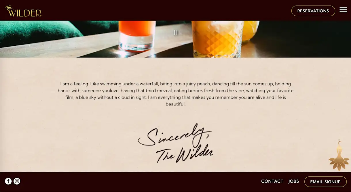
I am a feeling. Like swimming under a waterfall, biting into a juicy peach, dancing till the sun comes up, holding hands with someone you love, having that third mezcal, eating berries fresh from the vine, watching your favorite film, a blue sky without a cloud in sight. I am everything that makes you remember you are alive and life is beautiful.
Sincerely,
The Wilder
Why It's Effective
Even more than Death & Co., this description uses literary prose to read like a call to adventure. It is extremely avant-garde, framed like a letter from The Wilder to the reader, comparing the upscale lounge to a list of free-spirited actions like "dancing till the sun comes up" and "eating berries fresh from the vine." This approach would fall flat for many restaurants, but for a South Florida nightlife spot that appeals to guests through emotion more than reason, it's spot on. A plain description of the lounge space is the approach that would fall flat.
16. Suerte
Description Text
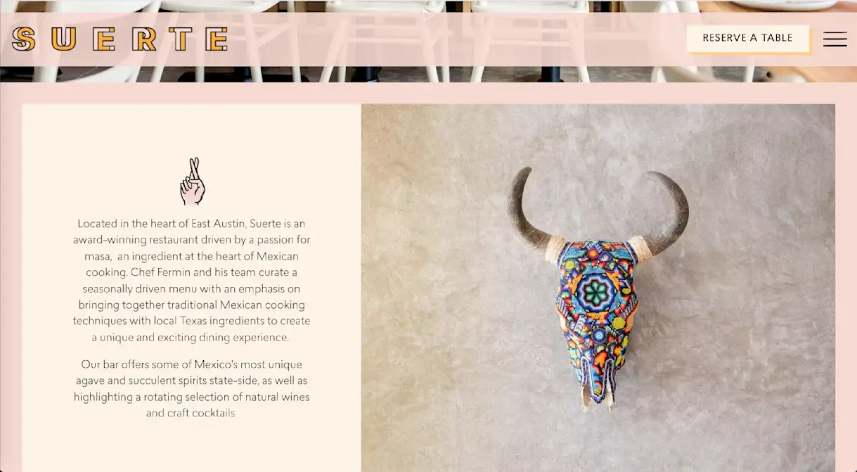
Located in the heart of East Austin, Suerte is an award-winning restaurant driven by a passion for masa, an ingredient at the heart of Mexican cooking. Chef Fermin and his team curate a seasonally driven menu with an emphasis on bringing together traditional Mexican cooking techniques with local Texas ingredients to create a unique and exciting dining experience.
Our bar offers some of Mexico's most unique agave and succulent spirits state-side, as well as highlighting a rotating selection of natural wines and craft cocktails.
Why It's Effective
The first sentence of the description clearly outlines something unique about the restaurant: its passion for masa. This establishes the "traditional" component of Suerte's menu, which blends traditional Mexican cooking with local Texas ingredients. The photo beside the description further amplifies this idea, showcasing traditional Mexican art while establishing a bright, exuberant visual style for the brand. When image and text work in harmony like this, it can be extremely powerful.
17. Craigie on Main
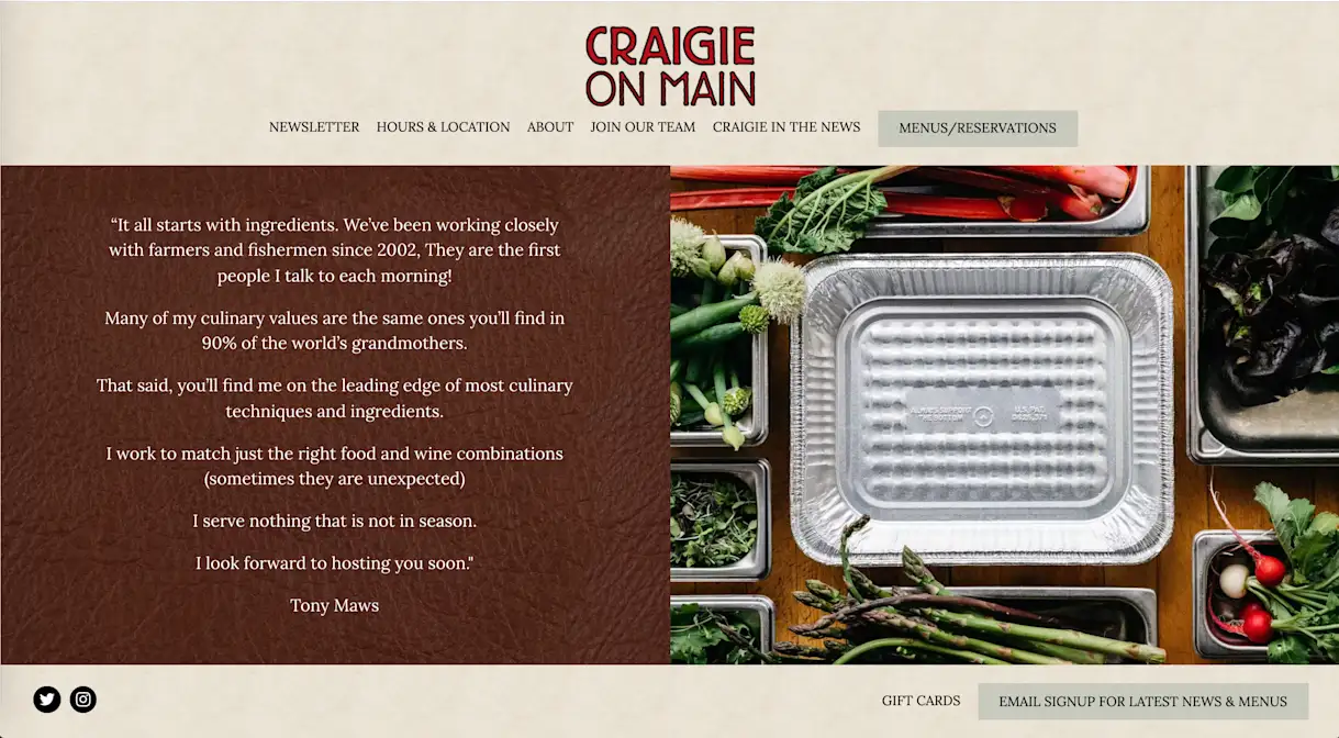
Description Text
“It all starts with ingredients. We’ve been working closely with farmers and fishermen since 2002. They are the first people I talk to each morning!
Many of my culinary values are the same ones you’ll find in 90% of the world’s grandmothers.
That said, you’ll find me on the leading edge of most culinary techniques and ingredients.
I work to match just the right food and wine combinations (sometimes they are unexpected)
I serve nothing that is not in season.
I look forward to hosting you soon."
Tony Maws
Why It's Effective
Craigie on Main's entire description is a quote from chef/owner Tony Maws. Speaking directly to the reader, Maws describes his homestyle cooking approach, explaining that farmers and fishermen are the first people he talks to each morning and comparing his culinary values to "90% of the world's grandmothers." The use of first-person perspective helps the quote come across as sincere and authentic, positioning the brand as a restaurant run by artisans.
18. Rosalie Italian Soul
Description Text
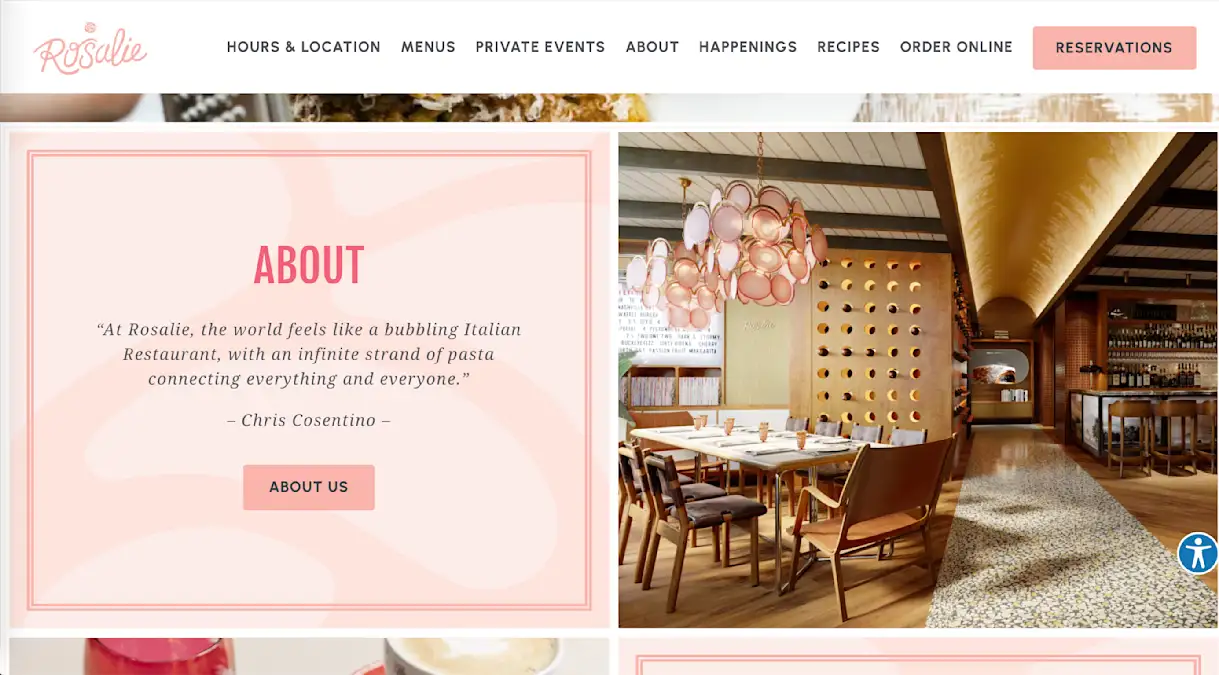
“At Rosalie, the world feels like a bubbling Italian Restaurant, with an infinite strand of pasta connecting everything and everyone.”
– Chris Cosentino –
Why It's Effective
Rather than a long, manifesto-style pull quote, Rosalie's homepage features a short, abstract thought from chef/owner Chris Cosentino. The quote does provide some important information — establishing Rosalie as a "bubbling Italian restaurant" — but more than that, it adds a dash of whimsy to Rosalie's brand. It's a captivating description that makes users want to learn more, which they can do by clicking "About Us" for a longer description or coming in to experience the space firsthand.
19. Crown Shy
Description Text
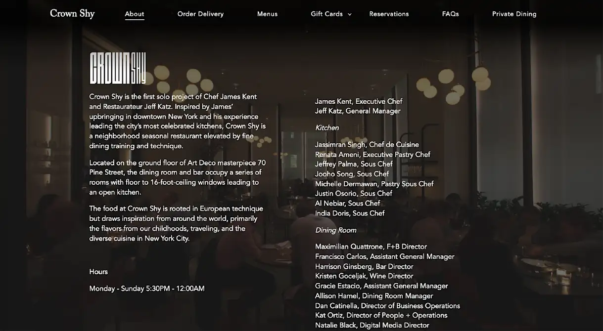
Crown Shy is the first solo project of Chef James Kent and Restaurateur Jeff Katz. Inspired by James’ upbringing in downtown New York and his experience leading the city’s most celebrated kitchens, Crown Shy is a neighborhood seasonal restaurant elevated by fine dining training and technique.
Located on the ground floor of Art Deco masterpiece 70 Pine Street, the dining room and bar occupy a series of rooms with floor to 16-foot-ceiling windows leading to an open kitchen.
The food at Crown Shy is rooted in European technique but draws inspiration from around the world, primarily the flavors from our childhoods, traveling, and the diverse cuisine in New York City.
Why It's Effective
Before users even start reading, the Art Deco-inspired logo and background image establish a refined mood. The description text delivers on that mood with upscale words such as "celebrated," "elevated" and "masterpiece." Supplementing all of this, the page lists more than 20 staff members, including management, kitchen and dining room. This decision — and the decision to use the same text design as the rest of the description — shows that the restaurant's people are central to its identity, which positions the brand as personal and human.
20. Tzuco
Description Text
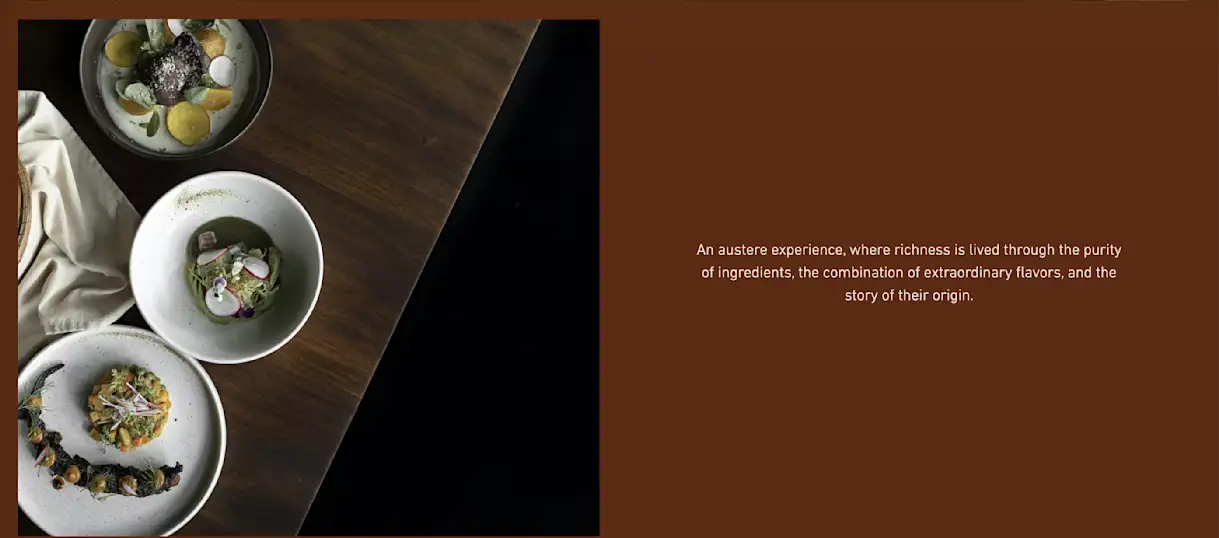
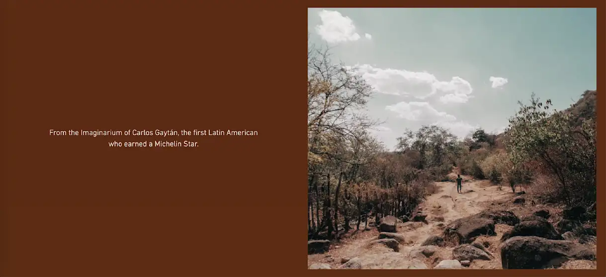
An austere experience, where richness is lived through the purity of ingredients, the combination of extraordinary flavors, and the story of their origin.
From the Imaginarium of Carlos Gaytán, the first Latin American who earned a Michelin Star.
Why It's Effective
This example is best viewed at the link above, where you can see how it uses scrolling to break up the text. Although readers only see one piece of the description at a time, it reads like one cohesive thought. This unique approach to telling the restaurant's story primes users for what Tzuco promises: an imaginative meal where the story of the food is central to the experience. Describing Chef Gaytán's mind as an "Imaginarium" adds even more whimsy and intrigue.

BentoBox Marketing & Commerce Platform
Deliver Smarter Hospitality
Want to stand out online, bring in more money, engage your diners, and streamline operations?
Recommended
Design Inspiration
The 14 Best Brewery Website Designs of 2024
May 4, 2021
Our favorite brewery websites that are #poweredbybento.
Websites
Eight Websites. One Brand. How H-Town Restaurant Group Drives Success Online.
June 2, 2022
After struggling with its website vendor, the group made famous by Hugo Ortega took ownership & started to flourish.
Websites
The Best Restaurant Websites in New York City
August 3, 2022
NYC restaurants are using BentoBox to grow their brands and increase their revenue. Here are some of our favorite examples.


