Design Inspiration
The Best Hotel Restaurant Websites of 2024
A roundup of hotel restaurants with beautiful, revenue-driving websites.
Like great hotels, great restaurants are places of respite from the rush of activity happening outside. They are oases of hospitality, self-contained and deliberately constructed to deliver guests something they can’t get anywhere else.
For that reason, hotels pair well with independent restaurants. Though not affiliated in branding or experience, a restaurant benefits from the hotel’s built-in foot traffic, while the hotel benefits from having the on-premises hospitality that only a restaurant can provide.
A great hotel restaurant website should promise this level of hospitality. It should tell a prospective guest that this space is a special one, with an identity all its own. The degree of connection the website conveys with the hotel can vary — from making no mention of the restaurant’s location to explicitly associating the hotel as part of the experience — but first and foremost, the website should make the restaurant look like a draw all on its own.
Scroll on to see some of the best examples of hotel restaurant websites right now.

RESOURCE
12 Must-Haves for Restaurant Websites
Take your digital front of house to the next level.
Le Cavalier
Wilmington, DE | lecavalierde.com
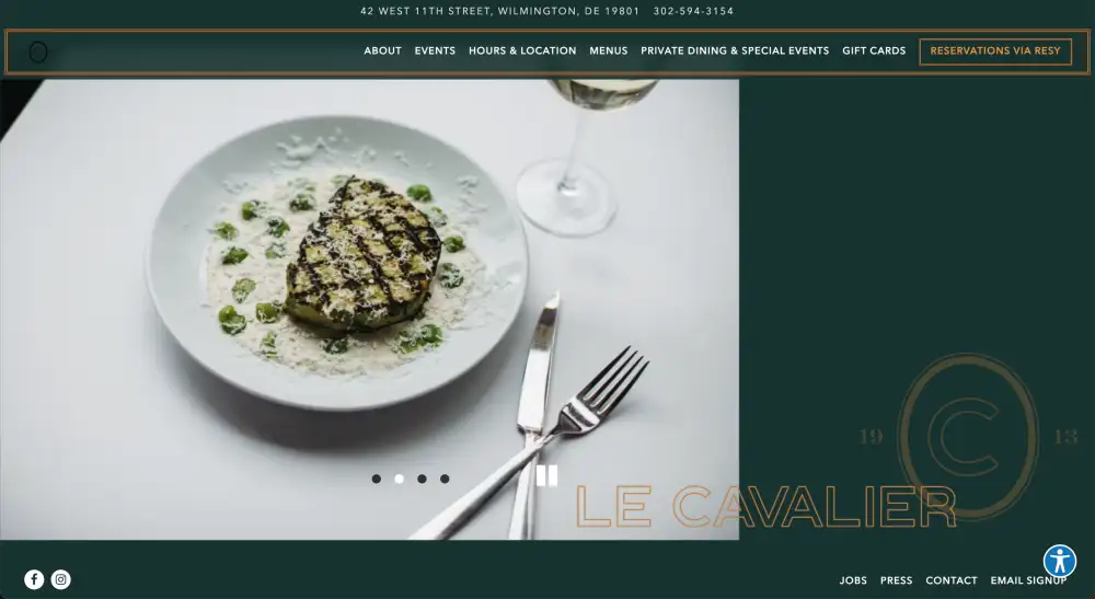
Consistently rated one of the best hotel restaurants in America, Le Cavalier is located in the Hotel Du Pont, a historic landmark in downtown Wilmington. The restaurant calls itself a “neo-brasserie” offering thoughtfully sourced French classics and inventive riffs on French staples. True to its refined ethos, the website features clean lines, bold colors, and beautiful photography.
Ruka
The Godfrey Hotel, Boston | rukarestobar.com
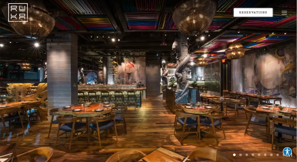
This Peruvian-Asian restaurant occupies the ground-floor corner space of the Godfrey Hotel, a four-star hotel located a block away from Boston Commons. The restaurant uses its stunning decor to fill the home page with a full-page carousel of visually arresting imagery, from the main dining room to its dramatically-plated dishes. Each informational page continues the theme, letting the website visitor know to expect a uniquely aesthetic dining experience.
Locanda Verde
Greenwich Hotel, NYC | locandaverdenyc.com
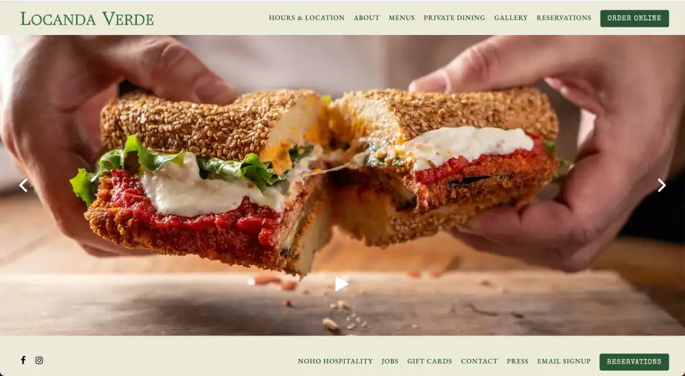
One of New York City’s favorite Italian restaurants sits on the ground floor of the Greenwich Hotel, a five-star boutique in Tribeca. Chef Andrew Carmellini’s “soul-satisfying” Italian is served in a cozy, welcoming taverna environment. The website reflects the same sense of warmth, with a page-wide carousel of inviting food and a simple, uncluttered layout.
Addison
Fairmont Grand Del Mar, San Diego | addisondelmar.com
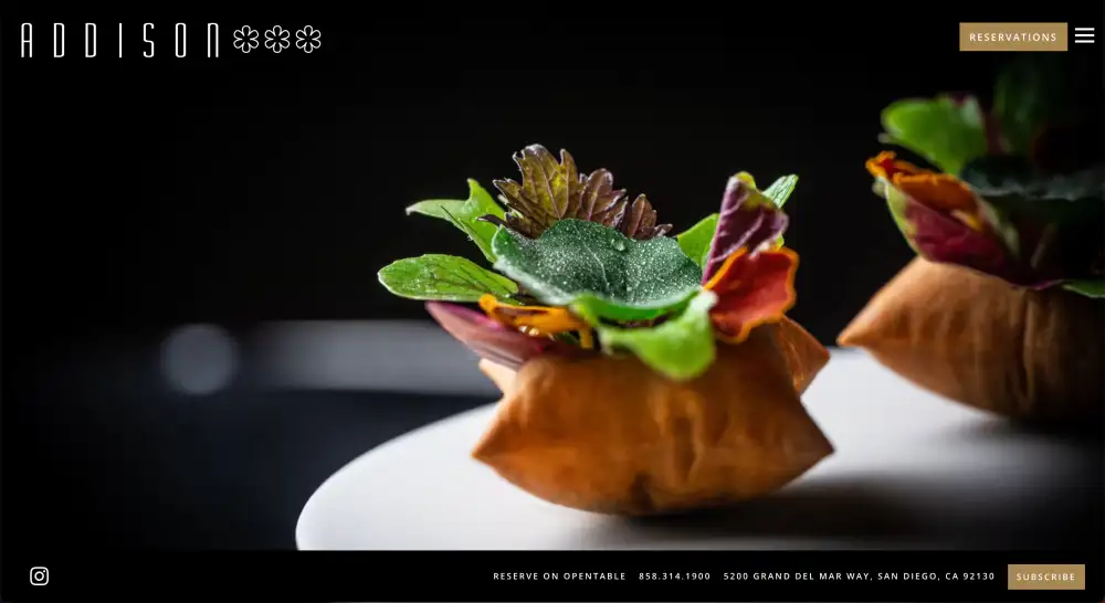
Southern California’s only restaurant with three Michelin stars is located within the Fairmont Grand Del Mar, a sprawling resort hotel with a golf course, five-star spa, and other luxurious amenities. With a name and reputation that precedes it, Addison’s website doesn’t say much; it doesn’t need to. A page-wide splash image and a prominent button for visitors to make a reservation is all that’s necessary to announce the restaurant.
Evelyn’s
Four Seasons Hotel, Ft. Lauderdale, FL | evelynsfortlauderdale.com
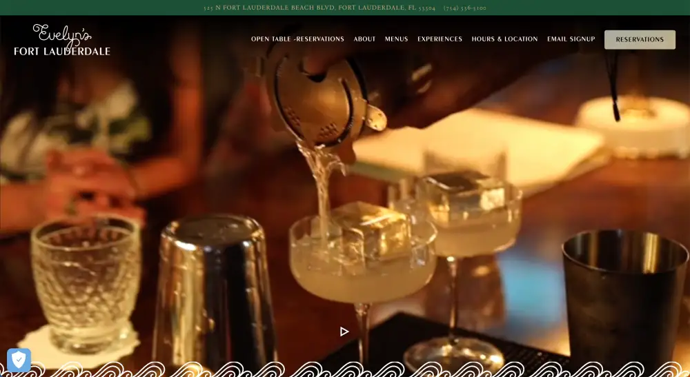
This restaurant, among the highest-rated in Ft. Lauderdale, serves Eastern Mediterranean flavors in an airy, light-filled dining room. The home page introduces the user to a refined experience from the moment the page loads, with a full-page video capturing beautiful shots of the interior, the food plating, and other aspects of service. The site features ample information about the restaurant, too, inviting visitors to join a vibrant history and come in for a visit.

RESOURCE
20 Inspiring Restaurant Website Designs
Design inspiration for your restaurant’s digital storefront.
Lumin
AC Hotel, Columbus, OH | luminskybar.com
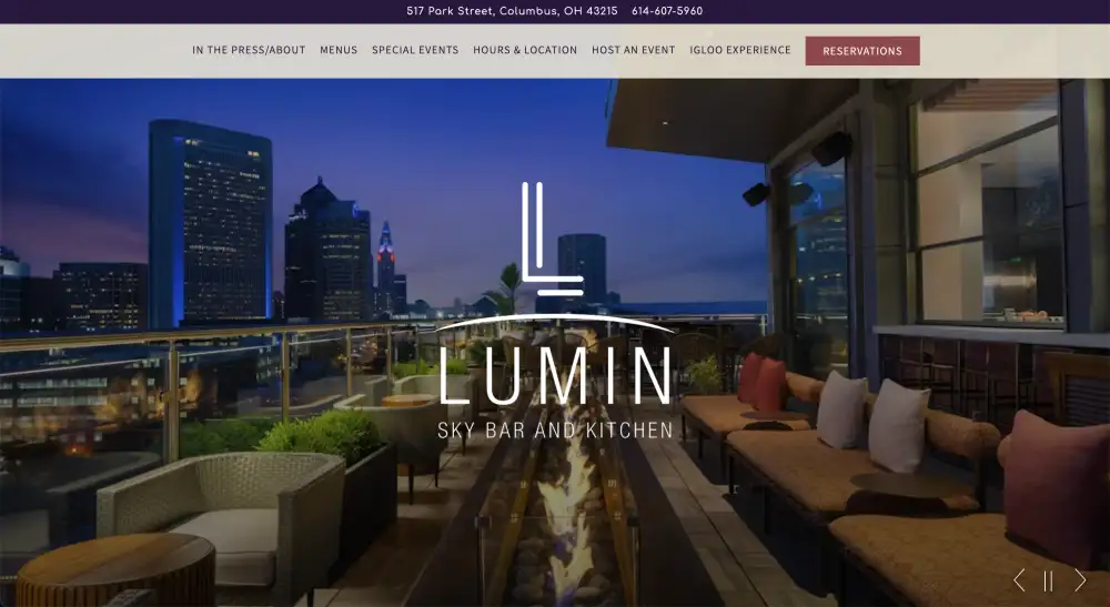
At the top of Columbus, OH’s AC Hotel sits Lumin, a rooftop lounge and kitchen with sweeping views of the city. Savory, Spanish-inspired dishes round out the offering. The restaurant’s website leads with its strongest selling point: the incredible views and the ambiance. The restaurant also offers “igloo” bubbles for cold-weather dining, which the home page’s full-width carousel makes sure to depict amply.
As You Are
Ace Hotel, NYC | asyouarebk.com
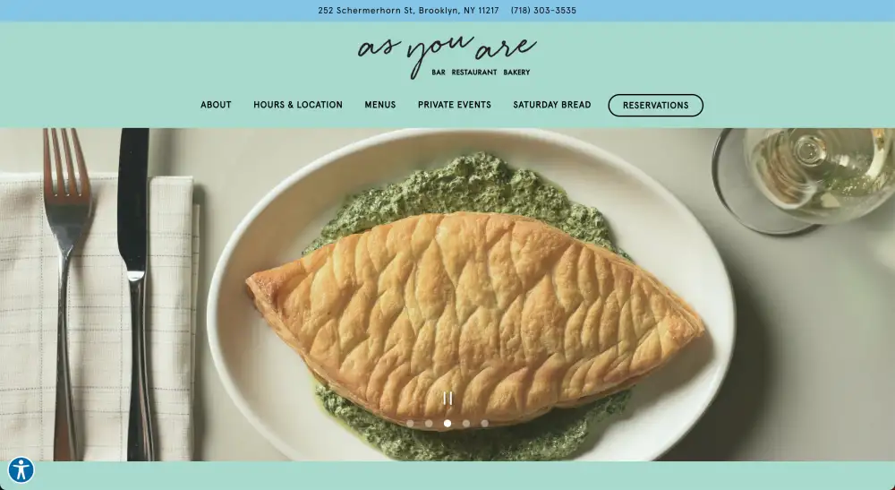
This bakery, restaurant, and bar on the ground floor of Brooklyn’s Ace Hotel is a welcoming dash of Americana. The food is familiar and homemade, and the website’s color scheme reflects that, letting the hand-lettered and ultra-inclusive logo stand in a placid field of teal, and featuring unadorned photos of beautiful, welcoming food. As You Are aims to reinvent the familiar, and its website hits the eye the same way: New, but something you’ve seen and liked before.
Broken Shaker
Freehand Hotels, various cities | brokenshaker.com
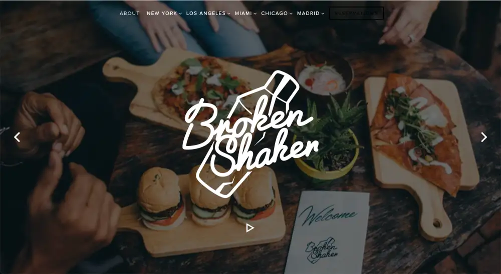
The Broken Shaker is the fun, modern bar concept that Freehand Hotels has built into five of its locations worldwide — four in the U.S. and one in Madrid. The goal of the website is to convey a fun yet cohesive aesthetic: to orient guests to their local location while inviting them into “a bar concept that is authentic, innovative, and mind-blowingly good.” This website is a great example of representing one concept in multiple cities. One brand, one experience, yet almost anywhere you find a Freehand Hotel.
Tellers
The National, Oklahoma City | tellersokc.com
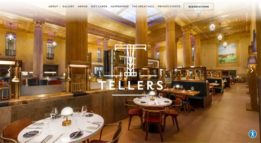
One of Oklahoma City’s most historic buildings, the National Hotel — converted from the old First National Bank — is home to this Italian wood-fired grill. The restaurant’s name comes from its setting in the former bank’s lobby, where restored teller windows surround the dining room. The restaurant’s website immerses the visitor in this environment, using bold, borderless photography and a simple logo to put a stamp on a magical setting.
Society Cafe
Walker Hotel, NYC | societycafenyc.com
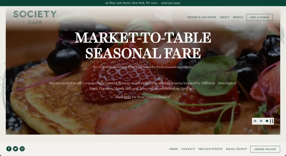
The ground floor of Tribeca’s Walker Hotel hosts this stunning cafe in a classic art deco-inspired space. The restaurant’s website reflects its commitment to hand-crafted dishes, with touches of hand-drawn fruit adorning its margins and a whimsically shaded-in logo.

PRODUCT
Build With BentoBox
Get a beautifully designed website with tools to grow your restaurant.
Recommended
Websites
No, Your Restaurant Doesn’t Need An App
July 10, 2024
Debunking a common myth about online ordering.
Websites
How to Choose a Restaurant Website Design Company
May 20, 2021
What to look for when searching for a restaurant website design partner.
Design Inspiration
The Best Bakery Websites of 2024
January 1, 2023
A roundup of some of our favorite bakery websites.
